Jamie Gwilliam, Autodesk’s visualisation and 3D application specialist, discusses some of the basics of composition and what we need to consider when creating a competent computer generated image and animation. This article covers many of his dos and don’ts, learnt during his professional career in architectural and product visualisation.
Before discussing what should form the basis of a good Computer Generated Image (CGI) we need to remind ourselves of the most important part of the process and, an area which is often overlooked, the purpose of the visual. We need to ask ourselves: ‘What are the key points to communicate to the viewer?’ It’s all too easy when working on an image to lose track of the main reason for it. Instead we get carried away with the small, insignificant details. These small technical design details will often add little to the overall impact, mood and effect of the animation or visual. It’s always worthwhile to draw up a list of five to seven important features that need to be communicated. This can be helped by re-visiting the original mood-boards for the scheme or product.
By helping to re-define the important differentiators of the project (for example the strategic balcony view or building’s footprint), we can ensure the imagery enforces the important key points to the viewer and end client. Remember, your job when producing a 3D image is to portray the unique points of the project in the clearest way possible, and not just to make a pretty picture. With photorealism we aim to fool the audience into believing that what they see is real. With technical visuals, our sole aim is to educate the viewer in the clearest way possible.
3D visuals generally fall into one of two categories — to either sell an idea or to improve upon the design. Both areas often require two different styles of visualisation. For example, a marketing image will be quite different to one required for a planning submission or massing model. A good 3D image doesn’t depend on the level of photorealism but on how well it matches its purpose. Once we have outlined our brief and viewers, we start to create our test compositions.
If this is the first visualisation project upon which you are embarking then you should create as many test ‘shots’ as possible. Create quick block previews from all angles within the project. These do not need to be fully materialised renders, but instead can be simple hidden-line screen grabs or greyscale renders. By producing grey renders, we can also check our 3D model for potential defects, which may have been overlooked. At this stage, all we are concerned with is the form and mass. This part of the process should be all about speed and experimentation. Treat the project as though it were a real-world development in which you’re running around with a digital camera. Take as many shots as you feel are necessary, then throw away the ones which don’t work. This will help you learn which angles and compositions work well for your next project. Ensure, however, that you give no more than seven concept shots to the lead architect or developer to choose from. Showing too many concept shots will often just lead to confusion and the client asking for a mix of a few, as they’re unable to make a decision.
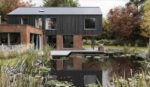
As a general rule, dramatic angles with large perspectives work well for tower blocks, whereas small dwellings benefit from a more refined approach where you would use a more natural lens. One concept which sits well with most visuals is to add a ‘Dutch Camera’ or ‘Dutch Angle’ effect. This is an early cinematic effect which often adds interest to an otherwise standard shot. Often, as seen in Figure 1, the horizon line needs to be tilted, and one of the perspective lines to run into the image’s corner (top right). It’s worth noting that this technique works extremely well if you wish to enforce the notion of speed and movement. The tilted angle will always add a level of drama to the visual too. Now look at the grey image (top left), and see how the composition’s impact is lacking. On a side note, this grey look is a great way to test angles, without being distracted by colour. It also has the added luxury of a faster render/production time.
This technique can be seen in many of the visualisation specialists’ work. Beware when creating animations, however, as it is easy to overdo this effect, and can result in a sea-sick end client. Also, experiment with the frame or image size to see what suits the effect. Don’t get stuck in producing a standard A4-proportioned visual. In the same way the Dutch angle will add to the mood of a 3D image, a change in image proportion will result in a different mood. For example letter box proportions add to the notion of speed as a result of the larger horizon line which is available to the viewer.
Cameras
Try to understand the basics of how real world cameras work. Read up on principles of physical cameras and try to understand the basic terminology. Often the best 3D imagery and artists employ real-world principles. If anyone in your office has a SLR, then these are people who will become great 3D visualisers as they should already have an understanding of composition and common photographic terminology. This includes concepts such as shutter speed and film ISO. Many of these terms are used within the 3D visualisation process and as such, the two worlds are overlapping more than ever. Many visualisation beginners fall into the trap of forgetting they’re in control of the camera and instead do all the shots at a ‘safe’ eye level. For extra drama in an interior image, try placing the camera in the bottom corner of the room and focus the target upwards to the ceiling. This will have the added benefit of making the space seem wider than it actually is, and will look less like a snap-shot.
Much in the same way that we look to cinematography and photography for inspiration, we should also implement their standard photographic and painting techniques. One such method is the ‘rule of thirds’.
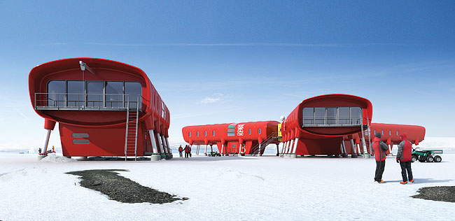
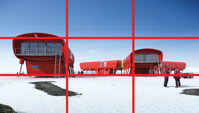
This practice of splitting the image into nine equal imaginary boxes requires the horizon line to be placed on or near to one of the box’s horizontal lines. This ensures the horizon is not distracting to the viewer by cutting the image in half. Implementing this simple technique the eye is held within the image for longer. The intersection of the box lines can also be used for the benefit of the 3D artist by adding strong focal points to this area of the visual. This can be illustrated by the two Spanish Antarctic base huts pointing towards the viewer forming a central area of curiosity, in turn retaining the audience’s interest (see Figure 2 overleaf). This remains one of the biggest challenges in visualisation. These meeting points are powerful places to add objects in an interior scene or focus on key exterior parts of the development. Next time that you’re using your compact camera, look out for this grid, on the camera’s viewfinder or screen.
Control
The rule of thirds ensures we are able to hold the viewer’s attention in the image, but by adding subtle elements into the visuals and animations we can control or predict where the viewer’s eye will travel. There are many procedures we can implement, but it’s often the simplest that has the most effect. Now let us look back at the previous expedition imagery. We can see how the audience’s attention is drawn into the image by more of these imaginary visual lines. We can imagine these lines drawn along the two front facing huts, roofs towards the centre of the image, forming a ‘V’ – thus leading us into the important background detail. In this case, the effect is subtle, but can often be more obvious by literal lines created by a road and path or a power cable for a product. It is these simple techniques which distinguish a good, captivating image from an average one.
{mospagebreak}
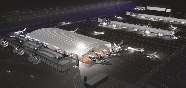
In the image in Figure 3 on page 17 we can see what I describe as the ‘Top Gear effect’. In the corners of the illustration there is a very subtle darkening to the edges. This is what we often see when using a wide-angled lens in the real world. This darkening is the result of the lens-hood or shield we would attach to ensure no stray light gets into the camera’s optics. The result of this is the clichéd lens flare of 1990s computer imagery. By adding this edge darkening we are also adding a sense of realism.
However, more recently this effect has been used to ensure that the viewer focuses on the centre of the image if there are no obvious focal points for the viewer to latch onto. In 3D terms, when rendered into the image, it often has the added benefit of providing a quicker render time, due to there being less pixel data for the computer to analyse. Next time you’re watching Top Gear, look out for this technique and see how the eye is forced to a strategic point in the sequence. Good 3D artists will make sure you pick up on the key elements.
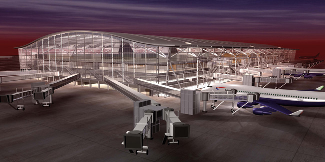
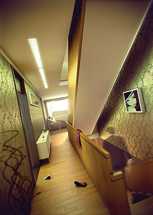
This technique of forcing the eye to strategic places is best revealed by Depth of Field (DOF). DOF is the process in which a selective part of an image is sharp and in focus, leaving the remainder of the image blurry and less distracting. In Figure 4 on this page we can see how, without the blur effect, the monitor screen in the foreground is the primary focus. With the blur added, this pushes the focal point back towards the security wall screen. The image is simply easier to look at. The artist forces the eye to concentrate on the part of the image which is sharp and full of detail, and important to the marketing of the project. This is a very effective technique, which generally works best on macros, or detailed close-ups.
As an example, this could be an interior shot which highlights a desirable basin tap, with the remainder of the room out of focus. In 3D image terms it is often best to leave this effect until after the image has been produced. Producing these effects are processor-intensive. To explore this workflow, I would recommend researching Z-depth and post-processing techniques.
Light and colour range
Colour will often characterise a mood and feel. It is important to revisit the mood board and inspirations for the initial design schemes to ensure the correct theme is carried throughout the full design phase. In Figure 5 we can see how the colour palette is from the same, warm tonal range. Now imagine the same image with a small red vase or a red chair. This would be far too distracting for the viewer and would therefore become an interruption to the flow. Colours should be considered in detail. These should be as much a consideration as the camera angle. In Figure 5 we can also see how the lighting carries that same warm, tonal range. Now, once again, envision the image with a blue palette. This would leave the viewer cold and create an unwelcoming mood in the visual. Generally, I feel that warmer tones tend to work with more classical designs and exteriors, while colder moods lend themselves towards ultramodern projects that can exploit bluer tones to their advantage by means of strong modern reflections, creating the notion of expense or luxury.
Colour theory in itself can create a challenging area for an artist, but the best rule is to choose a palette and carry it throughout the scheme. Don’t use too many colours. Lighting should fall into this same colour category and range. My technique is to quickly convert the image to black and white to see if the colour range works by highlighting any distracting elements.
Lighting can be a valued part of the image, and can often hide unnecessary, time-consuming detail. In Figure 5 we can see how the external windows have over-exposed, super bright areas. Generally this is what we would achieve with a real world camera. The room would be perfectly exposed (by means of a light meter) to show the detail within the room. However, because the room is perfectly exposed, this would result in the ‘brighter’ exterior being over-exposed and therefore appear super white.
Often, when recreating photography, it’s best to obtain reference photography from the internet to match it against. In Figure 5 we can see how the artist has recreated this effect perfectly. By doing this, our focus in the image remains in the interior. From a 3D point of view, this has an advantage for the artist by reducing the amount of data the computer package needs to analyse. Don’t get caught out and produce an interior image where the externally viewed sky is a perfect Spanish blue. Ensure the lighting conditions and environment are plausible. When adding this effect, it is often worthwhile to balance it with darker areas in the composition. The silhouettes will often fool the user into believing that there is a much greater level of detail than apparent. It’s also worth noting the soft and subtle glow around these over-exposed openings. This is where we can see the haze and dust particles within the atmosphere. I generally describe these ‘glare’ effects as ones you notice more when not there, than when they are. These straightforward, but effective enhancements will trigger the mind into believing it is authentic.
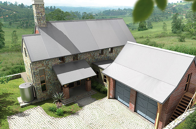
We can also employ some extremely straightforward techniques to add to the realism. In Figure 6 we can see how the artist has suggested that the camera is placed within a tree. This has been achieved by the addition of the two out of focus leaves in the top right hand corner. These leaves also help to frame the image. In computer terms we can add just these two leaves to suggest to the audience that the camera is in the tree. Our imagination will insert the remainder of the tree. By seeing the background wooded area, and by adding these elements, we believe the tree line to continue to wrap around the building.
As 3D artists, this careful placement ensures that we have less work to do to the image. 3D imagery is often primarily about suggestion of detail and complexity. We can see how this theme has been carried through the image. Notice the shadow in the bottom left hand corner. This again suggests that a tree is present, but without the hard work of actually adding and rendering the physical tree. Foliage remains a sore point for architectural visualisation. Often there is more detail within the foliage than in the actual development which results in an increase in computation and rendering times. We can also see how the background has been become less disturbing, by the addition of haze. Haze can be described as dust particles within the air. This automatically conjures up a notion of great distance and depth to the imagery.
Summary
Visualisation has advanced considerably within the past three years, however, the basics of producing a good image have remained the same. It is no longer just a ‘fluffy’ marketing tool, but can and should be part of the full design process. Visualisation is a necessary part of the communication process to ensure a visually informed design. Finally, it’s always a good idea to slow down and test compositions. Try to know and use the above rules and guidelines, but it is more important to not always feel as though you must stick to them. Study the work of other companies and decide what makes a good image. Choose images that you continue to look at and analyse what makes them attention-grabbing. Start by going back through the images within this article and see how many conventions they use from the above ‘rules’ we have discussed, if not all of them.
I hope that my guidelines above have offered some inspiration for those of you already creating visuals, and for those of you yet to try visualisation, I hope that this has encouraged you to try it in some form. Ensure that you explore ideas and angles, keep things simple to start with and most of all, be creative.