Autodesk sponsored the American Pavilion at this yearÝs Venice Architectural Biennale, where the company also hosted an evening on the topic of sustainable design in the face of global warming.
When Autodesk holds a marketing event it is usually to do with one of its products, either an imminent launch or some new technology that itÝs pulling the covers off. In October, Autodesk took a number of key clients and prospective clients (and press) to Venice to attend the Architectural Biennale, an international month-long exhibition where each country has a pavilion to present themed installations – this year on ÙCities, Architecture and SocietyÝ. There was no hard sell, no new products to push and it wasnÝt an in your face BIM pitch (how many of those have I heard now?). Instead, it was a really refreshing and thought provoking event, asking questions about how we can improve our designs.
Autodesk had been a key sponsor of the American Pavilion and Phil Bernstein, VP of AutodeskÝs Building Industry Division, came over to chair a number of media events. Our first stop off was the other side of Venice, a 20 minute boat ride away.

Impressions
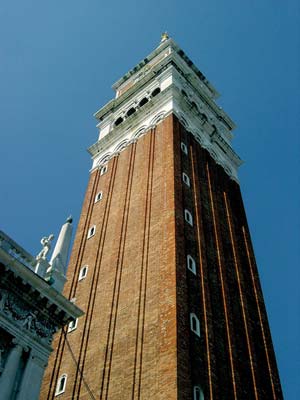
IÝd never been to Venice before. I arrived late and night and decided to go for a wander. The heat, even at night was a stifling 27 degrees and it was humid. With no map I wandered off around the twisty streets, crossing numerous bridges and trying to mentally overcome the complete lack of roads. The consistency in the architecture truly makes it an enchanting place and at night, you really can have the place to yourself. I eventually managed to get to St Marks Square, which was impressive in its majesty and the fact that nobody else was there added to it; even the Gondoliers had gone to bed. The impressive bell tower has stood proudly over this city for, umm, less than 100 years, as the original fell down after centuries of successive earthquakes. The Venetians didnÝt want to rebuild it but funds came from the mainland and it was rebuilt. I didnÝt find that out till I got back! I think I spent five minutes looking at the pointing on its bricks thinking it had been kept in good nick. It pays to know a little about where you are going in advance. I should also have read about VeniceÝs man-eating mosquitoes and gone prepared, as the Biennale is held in a ÙgardenÝ that might as well have been a Louisiana swamp, but thatÝs another story.
Taking the water taxi to the event gave the best views of the city, around the canals and then all along the grand canal into the Lagoon to the far side of the main island. Venice is indeed a beautiful place to visit, however in the summer during the day, it just has too many of us damn visitors to be pleasant. Having found my sea legs it was time to lose them and get ashore and visit the exhibition.


Venice Architectural Biennale
The American Pavilion contained an exhibition entitled ÙAfter the Flood: Building on higher GroundÝÝ, organised by the editors of Architectural Record. It proved to be a very moving exploration of New Orleans before and after the devastating Hurricane Katrina. As you entered the building a massive timeline showed the historical setting of Hurricane Katrina versus a range of other natural disasters that have hit New Orleans in itÝs past. It also highlighted the sheer size of devastation the Hurricane reaped on the 100 mile section of coast line. Katrina may well have been one of the biggest Hurricanes to hit New Orleans but with the timeline of events, it was obvious that the city was built in a problem area and it was probably only going to get worse if the predictions of global warming prove true.
The next installation was a sealed off area where a projection of the animated satellite images showed Katrina develop, grow into a category five hurricane and head towards New Orleans. It was the third largest Hurricane ever recorded to it land and was AmericaÝs most deadliest and expensive natural disaster. Levees separating Lake Pontchartrain from New Orleans were breached by the surge, ultimately flooding 80% of the city for weeks, causing $81.2 billion in damages and killing 1,836 people.
Moving though to the next display the room had many images of the destruction on all the walls, with projected video on the floors with natives of New Orleans recounting the stories, or driving/walking around their neighbourhoods. The US GovernmentÝs response was widely criticised and in fact, the theme of the American Pavilion was in tune with another Venice event that week, the film festival, during which Spike Lee launched his documentary film ÙWhen the Levees broke: A requiem in Four ActsÝ.
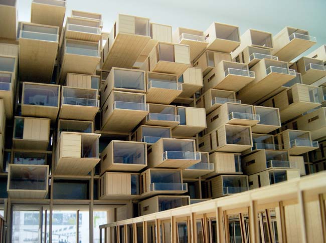
The final installations were a showcase of winning designs of an international competition to replace the housing in New Orleans. The design competition was organised by the Architectural Record and Tulane UniversityÝs School of Architecture and showed ideas single-family and multi-family housing. The exhibition also included some urban planning designs such as a park, as well as some sustainable designs which were entries from a competition sponsored by Global Green USA and film star, Brad Pitt. Pitt is actually a running theme in this article. HeÝs very interested in ÙgreenÝ architecture and I know he did a stint at Frank GehryÝs practice in California, but more on his involvement later.
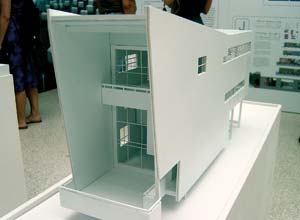
The models on display were really first rate, Eight IncÝs Sawtooth housing model was probably the most impressive. My only worries were that there seemed to be a lot of glazing in all the designs. Having just walked though a room full of pictures of tower blocks with not one window pane left, you had to wonder if the architects were planning on using bullet proof glass or not! Some debate was had, as to whether people should be building there in the first place, as the area was low-lying and prone to Hurricanes. But the decision isnÝt really there to be made, humans build in some of the most dangerous areas and live in bliss for hundreds of years Ùtil the big one hits. Think San Farncisco, Pompeii, Montserrat, Banda Aceh. If New Orleans is to be rebuilt, the new designs have to take into account the possibility of this happening again, sooner or later.
We took a guided tour around some of the other countryÝs Pavilions. With the ÙcityÝ theme, many of the displays dealt with China-related projects. With China using 50% of the worldÝs concrete, itÝs probably not surprising that China would also be using design talent from other countries. With that view, the Danish Pavilion was probably a misnomer as nearly everything inside it was related to China. These were huge housing projects on a scale that I hadnÝt really seen before. We were told China is building a NY ÙTwin TowersÝ every hour and is building an area the size of Manhattan every month. This is a scale of building that probably hasnÝt been seen on the planet.
With so many buildings going up and the requirement for water, power and other resources, the Chinese government has been looking at how the designs of the buildings can make the best use of these resources as there is only a finite amount of them. But still, this is big infrastructure and buildings are polluters, itÝs almost impossible to comprehend the scale of whatÝs going on in China. Some of the Danish designs were amazing in their size and aesthetics but I couldnÝt help thinking that the Chinese are replicating the errors of Corbusian 1960s concrete flat design. Maybe in 25 years time there will be a generation of Chinese malcontent kids spraying their estates with graffiti and urinating in the lifts. There were many other displays of note. I was particularly taken with an interactive MIT device which was a box filled with polystyrene beads. As you moved the beads around, creating topology of hills and valleys, somehow the computer could read these and then project onto the box a multi-coloured display of the variations in height. And it did all this in real-time. It reminded me of Sim City. You could play God and shape any landscape you wanted. There were also some innovative solutions to the transport problem. The Japanese pavilion provided respite from the tower blocks and cities with designs made from natural fibres and materials and not an urban population in sight.
ItÝs probably just me but from wandering around I realised I find cities depressing. The urban sprawl, the transport problems, the waste generated, the dirt and the grime. They are so artificial but ÙpureÝ mankind, machines that we design to live and work in. The way we have lived, post Industrial Revolution has meant we have little choice but to opt into one of these beasts and fight it out with everyone else. By 2050, over half the worldÝs population will live in cities. With our inability to stop fuelling Global Warming and years of inefficient building design to overcome and a short -term financial±return based outlook for most of our future building stock, you have to wonder where we are going.
Sustainable design
I didnÝt have to wait long to get the answer to that. A quick blat by boat back to our hotel to briefly enjoy the not-so-green air conditioning and count the number of mosquito bites, and then we were whisked off to an evening of presentations on sustainable design. Autodesk had sponsored a six part TV documentary series entitled ÙDesign:e2Ý (The Economies of Being Environmentally Conscious), narrated by Brad Pitt and it explores design through the eyes of the thought leaders in sustainable design, looking at how technology can transform the world around us and how we can build a sustainable future.
As the film started, Carol Bartz, ex CEO but still at large in Autodesk gave a piece to camera about the challenges that face designers and all of us with regards to sustainability. I think I was a bit dubious at the start but you soon realise that this series (we only saw one out of the six), really was an excellent production and wasnÝt about selling Autodesk product at all and you canÝt fault Autodesk for supporting such a thoughtful and challenging topic. In some ways itÝs the design-specific equivalent of Al GoreÝs ÙInconvenient TruthÝ but the twist here is that while Gore is light on the remedies, making it a tad depressing, this program explores whatÝs being done and where the leading edge research is heading. The Episode we watched, entitled Deeper Shades of Green, started off looking at the Singapore National Library, were architect KenYeang explained how in his design he wanted to make the building intelligent and efficient. While not being Ùzero emissionÝ, the building features escalators that only work when someone is near them, and automatic shading and venting to use as much natural conditioning as possible. I couldnÝt help thinking in green terms this is Ùlow tarÝ but as the program progressed the views got more radical and experimental.
William McDonough of William McDonough and Partners then really started to make us think. He held up a water bottle (Evian, Volvic, name your water), and commented ÙThis bottle is made with a poison that makes it un-recyclable; thereÝs no need for that to be in thereÝ. He went on to ask, why donÝt we think ahead when we design to put positives into the recycling process. If you are making paper plates why not make sure thereÝs lots of hydrogen in there so farmers want them to bury in their fields? McDonough was excellent at pointing out how lazy design is assisting in ruining the planet.
Werner Sobek, an architect and professor from Stuttgart then appeared and gave us a tour of his zero emission house, together with examples of his students work and actually turned up at the event to give a fascinating in-depth presentation on the research he is now doing. The main fact that came across is that zero emission is not easy and a lot of the recycling has to happen locally, not elsewhere.
I highly recommend seeing the programs when they air, sometime in Autumn in Europe. At the event Autodesk folks were talking about the possibility of it getting on British TV. I really hope that they get something sorted.
Robobat and Autodesk
AutodeskÝs take on sustainable design is that it wants to provide the tools to give designers really useful feedback as the design progresses. With 2D design, this canÝt really be done. But as the industry moves to 3D, Autodesk will look to provide tools that will help designers understand the environmental impact of their creations. As of yet Autodesk has little to offer but shortly before the event, Autodesk announced that it had purchased a French structural analysis developer, Robobat. This has little to do with sustainability but does indicate that Autodesk will be looking to buy in analysis technology now, as opposed to partner. Revit Structure offers links for other developerÝs solvers to link to the Revit model. This purchase could cause problematic relationships ahead for Autodesk in this field. I am sure others will follow.
I am impressed with Autodesk talking about a pertinent design issue and putting on such an esteemed event with lots of thought provoking comment. ItÝs the kind of stuff that makes you want to go live in a Tipi and live off the land! So long as there are no mosquitoes nearby.


