Jamie Gwilliam, Autodesk’s Visualisation and 3D application specialist, discusses how architectural design visualisation is no longer just about making a pretty marketing picture. With real-world examples he examines the needs, benefits and challenges involved.
In a recent article I made the comment that Visualisation is no longer just a ‘fluffy’ marketing tool. Below I expand this comment further and see how visualisation has evolved to form clear design benefits for all stakeholders in the design process.
For many users, visualisation is not primarily around the final glossy marketing image, but is more concerned with speeding up the approval process. Needless to say this marketing area often receives the most publicity, but for anyone involved with Design Visualisation, the main goal in all industry segments is to improve communication. Be it to those with technical knowledge or the general public, as part of an outreach project or public consultation.
Before we look at some practical examples of how visualisation can differ depending on the task and required objective, I want you to consider one more question. Why are we hearing so much about Design Visualisation at the moment? Design Visualisation is not a new term or idea, so what has changed?
The answer is simple competitive edge. We need to stand out from the company down the road who is chasing the same projects and clients as us. We need to win new business. We need to ensure we don’t make costly mistakes. We need to keep abreast of accessible tools and techniques.
Design Visualisation is one of the easiest ways for your project to be memorable, and ensure all client expectations are met and precisely communicated throughout the whole design development cycle. The important take-away being that it should form part of the entire design process, and not just thought of as the final marketing image.
Traditionally, technology has dictated that most visualisation occurs at the end of the project, when the details have been fixed. After all it was only really ten to twelve years ago that computer visualisation was born. It is now possible with little technical understanding to produce a competent visual within many of the CAD products available.
As technology, whether hardware or software, becomes extremely advanced and can dramatically aid the user, we have been able to implement these complex computing tasks into our normal fluid workflow. Why not quickly create fast concept studies, daylight analysis, and ‘glossy’ images into your CAD plans? And why not do this early on in the preliminary stages of a project? This will enable you to clearly present ideas and ensure all stakeholders expectations are met. It is always important to remember that many of the people we are pitching to do not clearly understand the detailing as we do. After all, a picture speaks a thousand words.
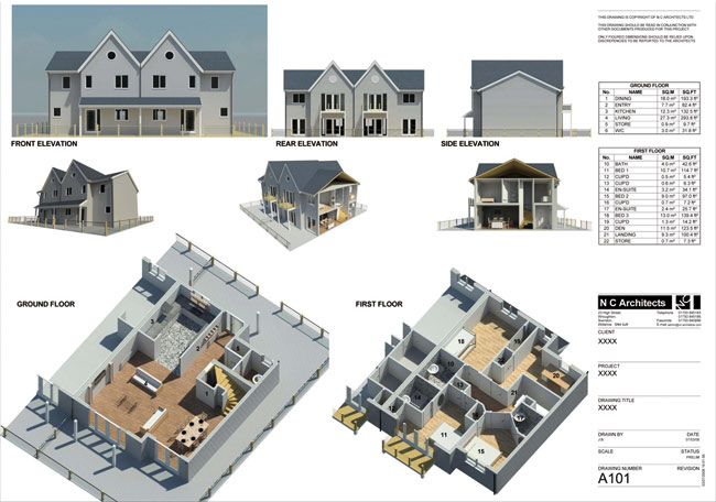
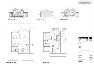
If we look at some examples from UK-based NC Architects we can see how the above ideology has aided them. Figure 1a shows the traditional CAD drawing that I am sure is familiar to us all. However, NC Architects has taken this phase further in Figure 1b and produced the ‘design visualisation’ detailing documents. Having implemented this workflow, strategic projects are now more appealing for planners to view, and helps the public understand all areas of your design development.
This has the additional benefit of reducing the chance of any unnecessary objections to your proposals during the planning stage, ensuring there are no costly delays. These documents also support the ongoing facilities management. All questions are rapidly and visually answered. In many countries visual design communication is becoming a government requirement for project approval to be obtained from planners, and I certainly feel we will see more of this happening. This is a truly memorable drawing document for the client.
Lighting analysis
One area that planners and governments are becoming particularly keen on seeing communicated visually is daylight analysis. Whether this is LEED accreditation for US tax credits, or shadow studies for right to light laws.
We are at the early stages of daylight analysis for mainstream projects and it is often performed to ‘prove’ a lighting solution works, rather than being included at the concept stages.
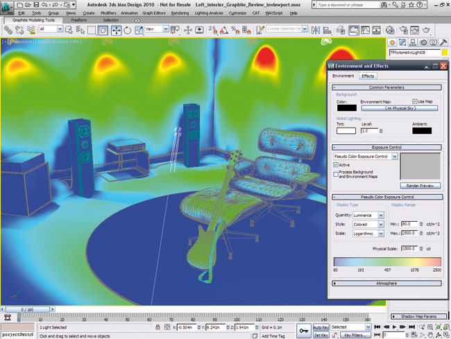
This daylight visualisation analysis workflow can be found in the ‘Exposure’ toolset within Autodesk 3ds Max Design. This feature set now brings a whole new ability to the typical ‘visualiser.’ The traditional visualiser is now able to work with the complex imported CAD data, and see how the accurate material properties, its geographical location, and lighting conditions, and any design decisions will affect the overall scheme. Most importantly, this analysis visualisation can happen at any stage of the design process. The toolset and workflow is primarily concerned with making immediate design decisions and improving the inhabitant’s quality of life. This, crucially, is completed within the application’s viewports, and therefore does not interrupt the standard workflow. Visualisation should not hinder the projects progress.
Typically, the visualiser is often left out of the main bulk of the design process. They will work-up the initial concept images from sketchy data, they will produce the final marketing image, but rarely will they be involved with cost-saving and environmental decisions on the project. This new form of visualisation workflow brings everyone closer to the whole design cycle.
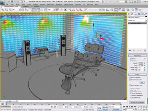
However, it is critical that we do not need to change our streamlined workflow to do this. We continue to utilise the same high-quality production techniques we are used to with ‘standard’ visualisation, but merely fit the ‘engineering’ analysis to suit our workflow. We can even produce a compelling cinematic animation, showing the daylight effects.
Design Visualisation can and should aid the design process by eliminating costly errors. For example, using this lighting analysis toolset at an early stage we can prove if a light fitting is in the correct position or strength for the interior desk space, if an under-pass needs extra lighting to stop a potential vehicle accident, and if a building’s form is suited to the environmental and geographical lighting conditions. This can often be referred to as a feasibility study.
The integration of CAD detailed designs and visualisation daylight analysis toolsets ensure the lighting conditions can be evaluated and visualised. This ensures all involved can envision the proposal’s consequences. We are able to explore different scenarios, with a resultant optimised design directly within the 3ds Max Design 2010 viewport (Figure 2).
It is because of this, visualisation is evolving. For many people the word ‘visualisation’ meant ‘a marketing image to sell a project’. However for me, and those I speak to, its description has evolved to represent a ‘communication tool to create a better project’.
The right tool for the job
On many occasions, we need to focus on being informative and communicate specific and important information. Visualisation is an important tool in the design process. This is never more true than when producing planning documents, or having a public outreach on a particular scheme. We have all been faced with documents and spreadsheets that contain pages of unreadable data. Of course this data is important, but one image which conveys all of that information to the none-technically minded public, is more critical. Over the page we can see how the latest Dynamite VSP solves some of these challenges.
This tool is aimed at users who need to validate their highway design, with increased visual accuracy. Sight Stopping Distance (SSD) checks are normally carried out in civil engineering CAD design applications, such as Autodesk Civil 3D. However, these civil models rarely contain all the information needed to truly analyse the model for visual obstructions or distractions. This includes foliage, signs, tunnel linings and gantries to name a few. All of these items can have an effect on visibility when the driver needs to quickly see an incident up ahead.
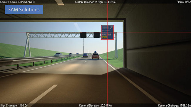
When we mix the standard design visualisation toolbox with specialist SSD tools within Dynamite VSP we are able to visually demonstrate that all aspects of the road project have been taken into account. This is the only compelling manner that allows all involved to clearly see the end result as a road user would.
In Figure 3 (page 20) we can demonstrate how the user is unable to view the signage until a certain distance when travelling through the tunnel. This allows us to make clear design decisions and move the gantry to a more suitable position. We immediately know the impact this scheme will have on the user.
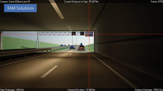
These SSD tools have a broad range of uses including, testing signal sighting on roads and railways, choosing placement sites for security cameras, and testing visibility to major new civil engineering projects generally from specific locations in the surrounding environment by communicating design scenarios and alternatives with ease.
Blind spots
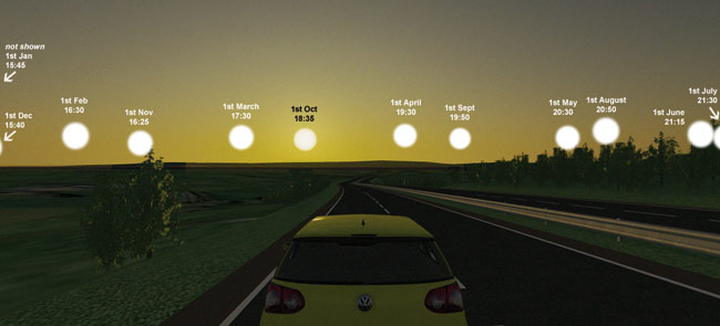
In Figure 4 we can see how Scott Wilson has combined the 3ds Max daylight system to visually prove how solar information and glare will affect the road user at different dates and times of the year. It is only by using standard design visualisation tools that we are able to perform these visually convincing arguments.
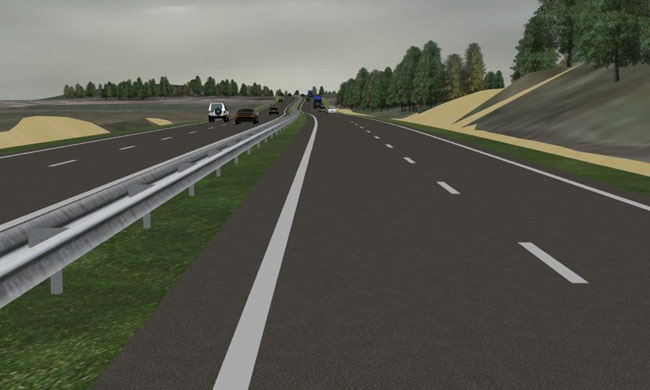
Whilst focusing on the civil world, we should also examine how Arup has implemented fast and raw visualisation tools into its workflow, removing extremely costly errors. In Figure 5 we can see how the ‘kink’ in the road is visually distracting for the driver. A momentary lapse in concentration will result in the driver potentially having an accident due to the road alignment.
While on paper this meets the stringent requirements for highway design, it is not until this visualisation phase, when the designers and stakeholders can drive down the road, that we are able to see how the planned vertical and horizontal road alignment needs resolving. It is therefore always important to visually simulate projects to detect errors and fix costly mistakes at an early stage.
What better way is there to communicate this to a highway agency or project stakeholder than by driving down it?
All of the companies mentioned use workflows that exemplify the real meaning of design visualisation. Ensuring no errors are made, and the design is improved. This is vital for projects such as this where we need to understand the complete design and its implications on safety.
Conclusion
In summary, we have seen how the ultimate goal of design visualisation is not just to make a glossy marketing image, but has critically evolved. The ultimate goal is now to optimise the decision-making process, and in turn, remove costly errors at an early stage. Design visualisation enables everyone to understand the project.
Intelligent design visualisation should support the exploration, validation, and communication phases of a project. Difficult problems can be accurately viewed and analysed in an instant. Design Visualisation should support the decision-makers and inform the general public. The end goal for all of us is to create better projects and ensure the requirements of everyone are met.
Of course, the real skill will remain with the user who not only creates a visual, but stands out from the competition. However, the techniques and principles have become more mainstream. Technology and the speed it has brought about, allows all of us to test ideas faster and find a better solution than was first apparent.
Design visualisation is no longer about making fluffy images.
About the author
Jamie Gwilliam produces an informative 3ds Max and design visualisation newsletter. To subscribe please go to www.tinyurl.com/jamiesjewels

