Liverpool-based design consultancy Uniform took a more abstract and visual route for its promotional ÙCrystalÝ film for Foreign Office ArchitectsÝ first UK project, the Trinity EC3 office scheme in the City of London.
Uniform has become one of the best of its kind offering design, film, brand and image services to forward-thinking clients in the architecture, retail, arts and fashion sectors. Some of its recent high-profile projects include marketing campaigns for Beetham Tower Manchester, the tallest residential building in the UK, and the Liverpool One development for Grosvenor; and branding and design for the Liverpool stand at MIPIM, a property exhibition in Cannes.
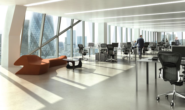
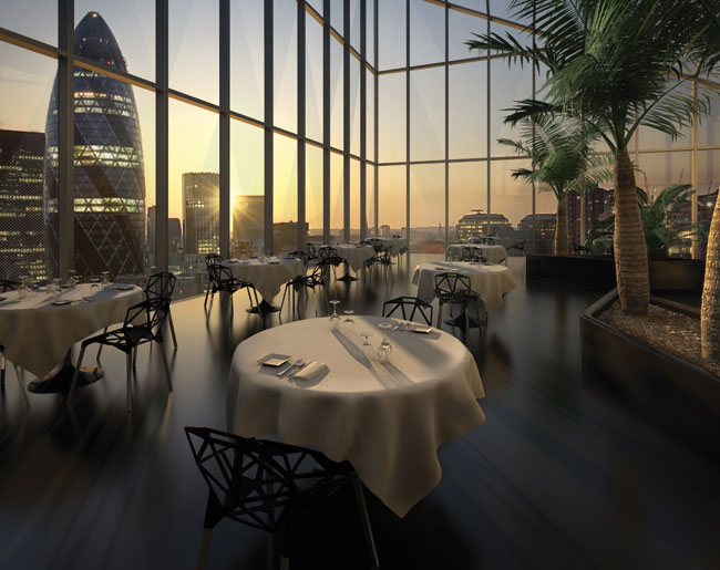
Uniform has spent the past two years largely focused on film projects for which it uses Autodesk 3ds Max 3D modelling and animation software and Autodesk Combustion desktop visual effects software. The company has recently produced a film, shot entirely in HD, to promote Foreign Office ArchitectsÝ first UK project, the Trinity EC3 office scheme in the City of London. The development will consist of three glass office buildings and is being developed by luxury property developer Beetham Organization. The prime office scheme will also allow direct access to Aldgate tube station, a new bus station, as well as shops, restaurants and a 23rd floor panoramic conservatory with unrivalled views over The City.
Beetham Organization commissioned the film to help launch its proposal for Trinity EC3 at MIPIM 2007. They wanted a film that would inspire and engage people ahead of the buildingÝs completion in 2013. Beetham Organisation has worked with Uniform for several years but had never commissioned a film before. They were keen to see what Uniform could do based on its previous film and animation work for other clients. UniformÝs creative director Laurie Jones explains: ýOur approach with other clients has been to react to briefs in a creative and challenging way which isnÝt often the case in our industry. ItÝs this approach that ensures weÝre a design agency and not a visualisation company.¯
Inspiration
There was no set brief, rather an ongoing discussion between Uniform and Beetham about general criteria such as location, transport links, style, historical issues and floor space. These criteria were filtered down to the core purposes ± which were to build the brand of Trinity EC3 as a high value, design-led development, and portray its location as part of the London City ÙclusterÝ.
The three glass edifices will be highly noticeable and director of Foreign Office Architects Alejandro Zaero-Polo stresses: ýThis is not going to be another high-rise statement. The crystalline aesthetics create the possibility of playing games with reflection and transparency across surfaces that are not vertical ± the default condition in the city. Tilt the surfaces towards the ground and they become more transparent; tilt them towards the sky and they reflect more light. This creates a kaleidoscopic world where different activities around the buildings and inside the buildings will be brought together as impressions of the City.¯
{mospagebreak}
UniformÝs ÙCrystalÝ film plays on the architectsÝ inspiration, the structural aesthetic of crystals. It follows three crystalline structures that explore the design features of the development using the City of London as a cinematic backdrop.
The viewer is taken on a journey through reflection, refraction and light as the transient crystals imitate, investigate and discover the shape and visual forms that create the fabric of the City and the Trinity buildings.
This gave Jones and the team at Uniform a breakthrough in terms of the creative challenge: ýWe discovered what we didnÝt have to show was as important as what we did have to show. This allowed us to take a more abstract and visual route with the film rather than it becoming an ÙinfomercialÝ. We then had the freedom to employ narrative and art direction that youÝd normally find in broadcast commercials. And from a technical point of view it meant we were going to have to deliver the slickest looking visuals weÝve done to date.¯
The film plays on the architectÝs inspiration: the structural aesthetic of crystals and the reflection and refraction of glass. Uniform created a mood board using film references to develop the look and feel for the piece. They then created a storyboard and animatic in order to communicate this vision to the client. The animatic consisted of a hand-drawn background with 2D animated crystals over the top to portray the basic idea of the film: three crystalline structures that explore the design features of the development and the architecture of London using the City as a cinematic backdrop.
The shoot
Before filming commenced, Uniform did a recce to get reference shots of appropriate locations within the City, which included iconic buildings such as the LloydÝs Building and the Gherkin. The day of the recce was a beautiful sunny day, it couldnÝt have been any more perfect, but the weather on the actual shoot wasnÝt as good. Filming took place over four days in September last year, and a lot of time was spent waiting for clouds to move. ýIn one or two of the shots we missed out on playing with the refractions and reflections of the crystals because of the lack of direct sun,¯ says Jones.
Further footage was shot from a helicopter with a gyroscopic mounted camera which moves independently from the helicopter. Uniform also shot high dynamic range images (HDRIs) using a standard digital camera with a fish-eye lens and a tripod that spins around to shoot a perfect sphere. By doing this at different shutter speeds, it captures very dark and very bright colour values to produce HDRIs. These were used for the skylines created in 3ds Max and for reflections in buildings such as the Gherkin.
Grading
The team used Combustion to grade the footage to set the mood and match up all the shots. This proved to be one of the trickiest things to get right because of the different weather conditions. The colour tone varied hugely across the various shots and the helicopter footage was very hazy and tinted brown. As heavy grading creates noise, Combustion was also used to get rid of this.
ýWe used Combustion to convert the bit depth of the footage from 8-bit to 10-bit to give more levels of colour and subtlety of lighting,¯ says Sam OÝHare, senior designer at Uniform. ýThis allowed for finer tuning when neutralising the brown tinge and matching colour across the shots. We then did another grade to give the footage a cold, bluer tint for mood, pulling out the colour of the foreground, background and the Gherkin. CombustionÝs industry standard colour correction tools made this a swift process, even when working on uncompressed HD footage. The final colour of the piece ties it all together.¯
{mospagebreak}

Modelling and animation
All modelling and animation was completed with 3ds Max. The crystals were modelled by hand in 3ds Max and Uniform used a technique from the games industry to morph the crystals as they move. One crystal was copied five times to ensure that all variations had the same number of sides, vertices and polygons. Using the morpher option, the different shapes could be blended together, creating an infinite number of shapes. Uniform used a Maxscript to create their own user interface to control how the crystals morphed.
The team used two techniques from the film industry to make the crystals and buildings more accurate and realistic. Camera maps were projected into the block modelled buildings and backgrounds behind the crystals. The Crystals then reflected these backgrounds, making them more believable. Since all you see in the crystals is refracted scenery, this was very important. The other film technique – matte painting – was used on a tight overhead shot of the building from the fish-eye lens camera to produce accurate reflections in the sides of the building.
Rendering
Separate render passes were created for every element: each of the crystals, reflections, mattes for reflections and other Ùper-shotÝ passes such as the GherkinÝs grid of windows. These were rendered using a variety of third-party renderers such as V-ray, Brazil and Mental Ray to get different looks and effects from the crystals, from caustic light reflections to realistically refracted light. Scanline was also used for producing mattes for the compositing process. All the passes were then composited using Combustion, with each shot being made up of four passes or more.
Multiple render passes were needed to get the crystals to match the background footage correctly and reflect realistically in the buildings. Tinted reflection mattes were used to cut through the existing reflections on buildings and allowed the rendered passes to be laid seamlessly over the top. This gave much more flexibility to adjust the colours and tones to fit the footage perfectly, meaning less re-rendering.
Crystal is the first piece that Uniform delivered in full 1080p HD format so all of the scenes were much more detailed than usual. This meant that polygon counts were very high on some scenes. ýWe used the 64-bit support of 3ds Max 9 to make it feasible to render all these scenes at full resolution,¯ says Jones. ýThe final result was played back on an LCD TV through a dedicated HD player and it looked great. It was definitely worth the extra time!¯
Jones is delighted with the results: ýIt looks very realistic and reacts exactly how we wanted it to in terms of reflection and refraction. From a technical standpoint IÝm very proud of the teamÝs efforts with the imagery of the building itself ± the Trinity scheme looks fantastic, particularly when matched into the aerial footage. The client was very pleased with the final piece and it had an incredible response at TrinityÝs launch at MIPIM, even better than we were hoping for. The trust and commitment from Beetham in commissioning the film has paid off which IÝm really happy about.¯
The stunning film will no doubt ensure that Uniform upholds its reputation as one of the best design and digital media consultancies in the world.
www.uniform.net
www.autodesk.com


