Trimble’s popular conceptual design tool gets an impressive port to the Apple iPad, plus potential to dramatically change the way AEC firms bring site data into the design process, writes Greg Corke
SketchUp has legendary status in the AEC sector. You’ll find it on the desktop of most architects, especially those that don’t feel the need for BIM authoring tools like Revit and Archicad, or want to learn how to use them.
With its simple push / pull approach to modelling you can knock up a simple design in minutes. And without the parametric constraints of BIM, it’s ideal for the conceptual phase where the design is still fluid.
SketchUp has gone through many owners over the years. Launched in 2000 by @Last Software, it was acquired by Google in 2006, then sold to Trimble in 2012. For many years, the beauty of SketchUp was that the capable base product was free.
While a free version still exists today, it runs in a browser, and has limited interoperability with CAD / BIM software. For professional use, and access to the desktop app on Windows or Mac OSX, you’ll need a ‘Pro’ subscription.
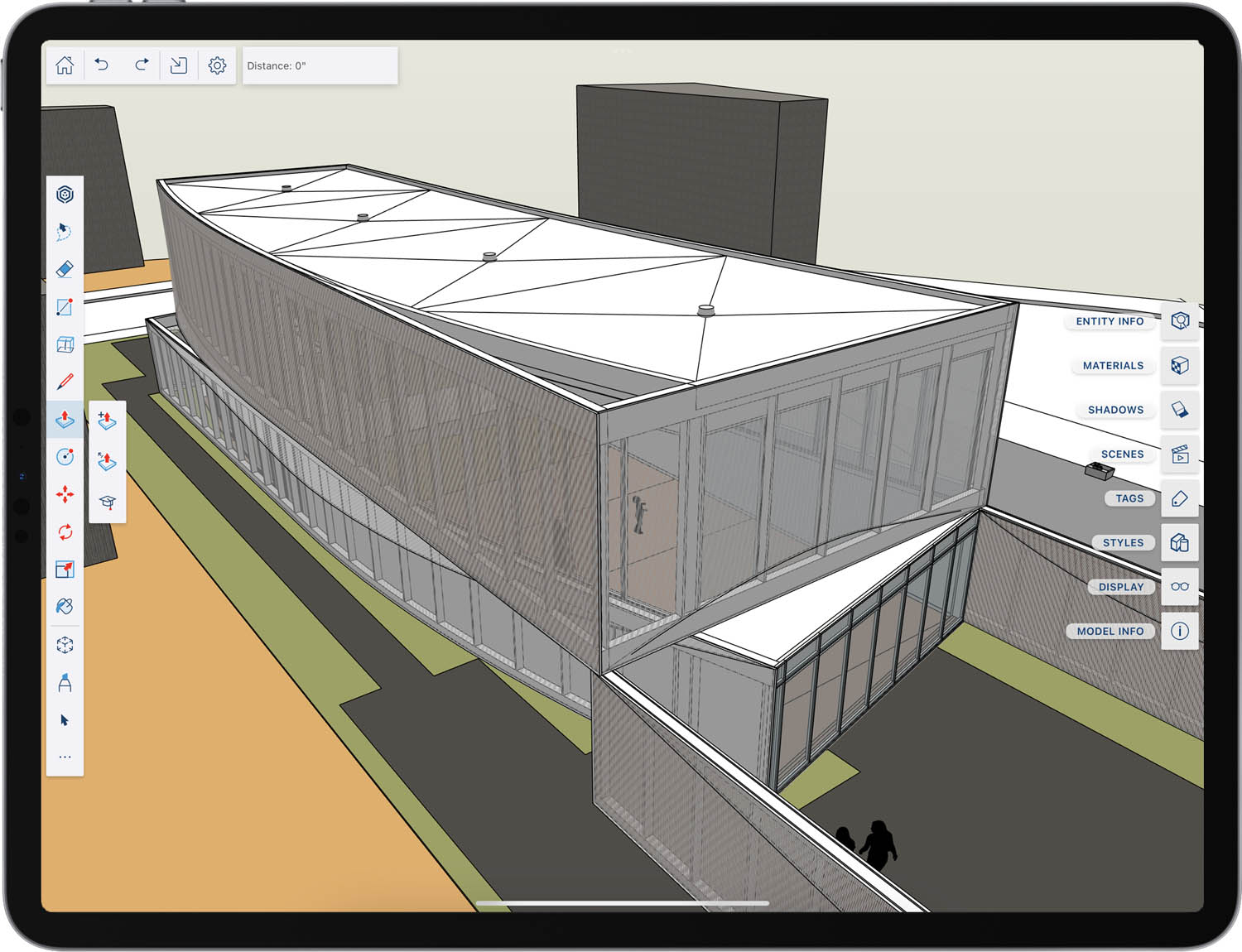
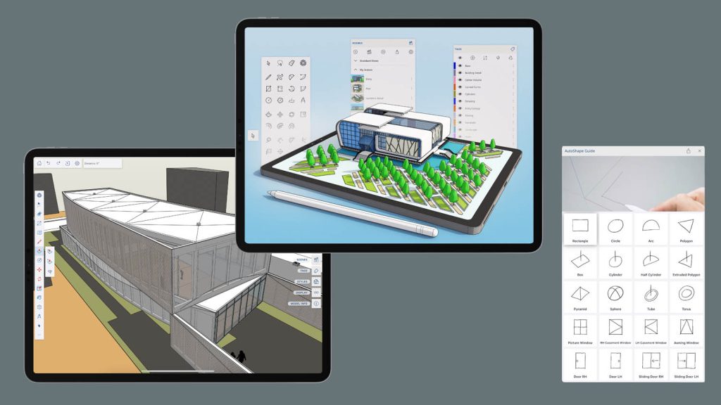
Last month, Trimble introduced a brand-new version written specifically for the Apple iPad. Unlike many AECfocused iPad apps that have previously made the move from desktop to Apple iOS, SketchUp for iPad features nearly all the functionality of its Windows and Mac OSX counterparts, but through a brand new user interface that has been optimised for touch and the Apple Pencil.
The software is included in several different levels of SketchUp subscription. In SketchUp Pro (£235 per year) you can work across iPad, desktop or browser with full compatibility between the different versions. SketchUp Studio (£549 per year) adds support for point clouds and rendering with V-Ray.
We tested out the software using the 5th Generation iPad Pro, together with the 2nd Generation Apple Pencil, which attaches magnetically to the side of the iPad. Here it charges incredibly fast – 15 seconds of charge will give you around 30 minutes of use. 30 minutes will charge it fully and it will last for around 12 hours.
Despite officially being classed as a tablet, the iPad Pro is an extremely impressive piece of hardware. Powered by Apple’s M1 chip, it’s fast and responsive and the Liquid Retina XDR display a thing of beauty. It also has plenty of storage, up to 2 TB, incredible front and rear facing cameras and a LiDAR sensor built in. The top end models, however, will set you back close to £2,000.
SketchUp for iPad will run on any iPad with iOS 15, although Trimble recommends the most powerful M1 models. Even though the software was developed for the 2nd Generation Pencil, it will still work with the 1st Generation Pencil.
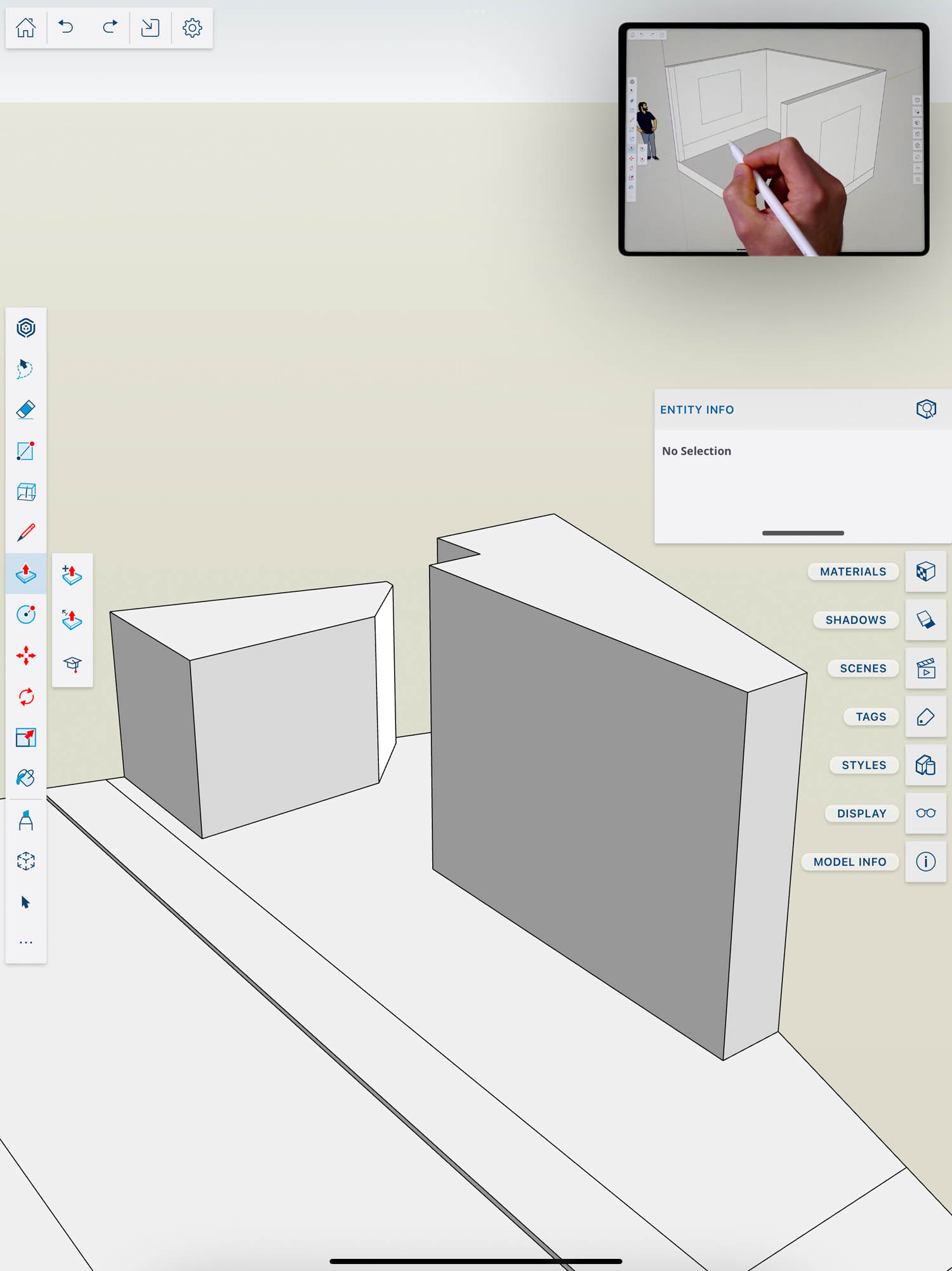
The SketchUp for iPad workflow is very similar to the desktop version – simply sketch out 2D geometry, then push and pull it into place to create 3D objects. This can be done by eye, by punching in dimensions, or double tapping to pull it the same distance as the one before. For a really quick concept design, length snapping allows you to model at 0.1m or 1m increments.
The most exciting thing for us is to consider where SketchUp for iPad might go in the future. If Trimble taps into the power of the LiDAR scanner on the iPad Pro, it could transform the way SketchUp is used at those preliminary phases of design.
Of course, interaction through the Apple Pencil is completely different to keyboard and mouse. While using an iPhone is second nature to many, if you’re new to iPad (and Pencil, in particular) it takes some getting used to.
The other thing to note is users don’t get direct access to the wealth of third-party add-ons that are available for the desktop versions, particularly on Windows.
Getting started
On startup you’re presented with a home screen where you can see all your recent models, including a preview. These can be stored locally on the iPad, or in the cloud.
Trimble has put a lot of effort into connecting SketchUp for iPad to Trimble Connect, its cloud-based collaboration platform. The idea is that it allows users to move seamlessly between multiple flavours of SketchUp, whether that’s iPad, browser, or desktop.
If stored on Trimble Connect, you’ll see a little Trimble Connect icon in the model details card. If local, there’s a little file apps icon. Users can also sync files to other cloud services, such as Google Drive, Box and Dropbox.
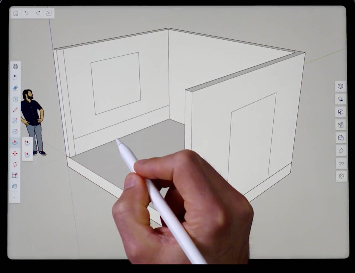
The home screen also provides access to a few self-paced tutorials. These introduce you to the key concepts and run directly inside the SketchUp environment, guiding you through step by step. It’s quite a smart way of doing things, as it shows the end result on the left, while you model on the right. The SketchUp YouTube channel also has a tonne of excellent tutorials to introduce the many different tools. More are being added all the time.
The user interface
The UI is very clean, and only serves up the on screen controls as you need them. The measurement box, for example, only appears when the software expects a measurement.
There are three main sets of controls. Top left is home / save, undo and redo, file import and settings.
The main toolbar is on the left and here you’ll find twelve of the most commonly used tools, such as lasso select, eraser, line, rectangle, circle, push/pull, move, rotate, scale and AutoShape (see later). Some come with secondary options, which appear when you click the icon. With the line command, for example, you can lock to a specific axis or parallel / perpendicular to a selection or the last line drawn. This is different to the desktop version, where you don’t have to lock before you draw the line.
There are no tooltips for these controls, so it can take a little while to work out what’s what. However, some include a ‘learn’ button that instantly plays a short video to show you the basics. We found this incredibly useful compared to scrolling through pages of help files.
At the bottom of the toolbar there’s an icon with three dots. When clicked it reveals an expanded toolset of 26 more commands, such as polygon, dimension, arc, freehand, and markup (see later). The three most recently used will appear at the bottom of the toolbar. Everything is fully customisable. A ‘long press’ allows you to drag and rearrange their order.
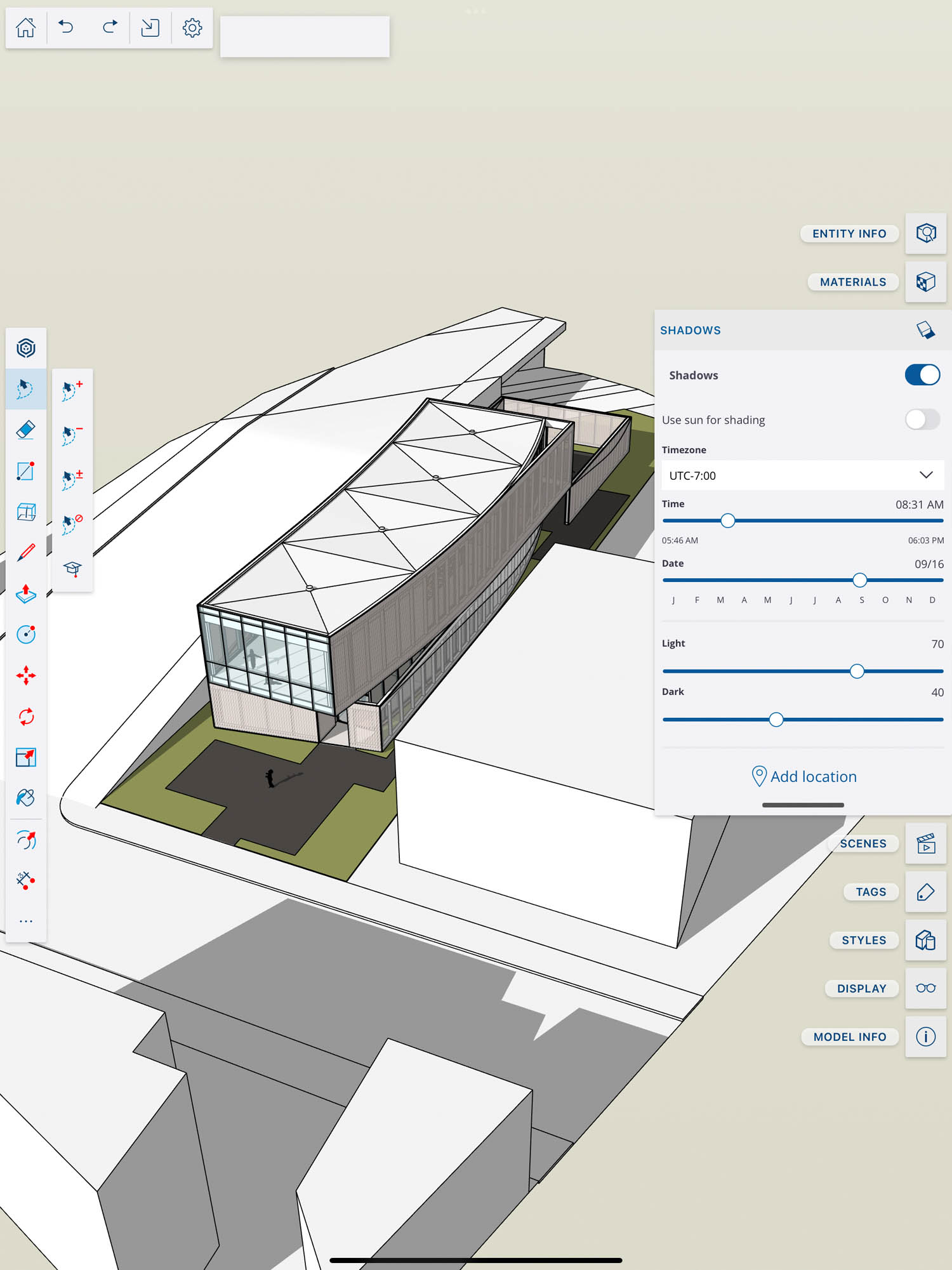
On the right there’s a panel toolbar where you can control things like materials, shadows, styles, tags and entities. Click an icon to open up the relevant palette of commands, then click again to close to keep the UI clutter free. If you can’t remember which is which, swipe left to show the labels and swipe right to hide. As with the left-hand toolbar, you can drag and drop to re-order.
Multi-input
The primary method of interacting with SketchUp for iPad is with the Apple Pencil.
There are two modes: ‘Just Draw’ works in much the same way as a pencil and paper, whereas ‘Click-Move-Click’ takes advantage of the Pencil’s pressure sensor, so you can infer things in the model before hard-pressing to start and / or complete an operation. ‘Click-MoveClick’ provides more control but, as the name suggests, requires more clicks.
Multitouch is also supported, but fat fingers and modelling aren’t always the best bedfellows.
Things feel most comfortable when using a combination of Pencil and touch: the Pencil for precision input and touch for navigation – one finger swipe (orbit), two finger (pan), pinch to zoom in and out, and a quick pinch for zoom extents.
While SketchUp for iPad doesn’t include all the features of the desktop product it certainly doesn’t feel like a cut down version with limited functionality
You can also attach a Bluetooth keyboard and mouse to use SketchUp in much the same way you would the desktop version. With Apple’s Magic Keyboard, which has a built-in trackpad, you can essentially turn your iPad Pro into fully fledged laptop.
Furthermore, as all the keyboard shortcuts and modifiers work with the software, it would theoretically be possible to use all three input devices at the same time, invoking commands with the press of a button, sketching out geometry with the Pencil and manipulating the model with your hands.
AutoShape – shortcuts for objects
AutoShape is a new machine-learning feature designed to transform doodles into 3D shapes and configurable components. This includes standard 2D and 3D primitives, as well as a range of doors and windows that can be parametrically edited and configured.
AutoShape mimics how users naturally draw objects with a pencil, and not how they model them with a mouse on a desktop app. In CAD, for example, a circle is defined by setting the centre point, then the radius. With AutoShape, you just roughly sketch a perimeter.
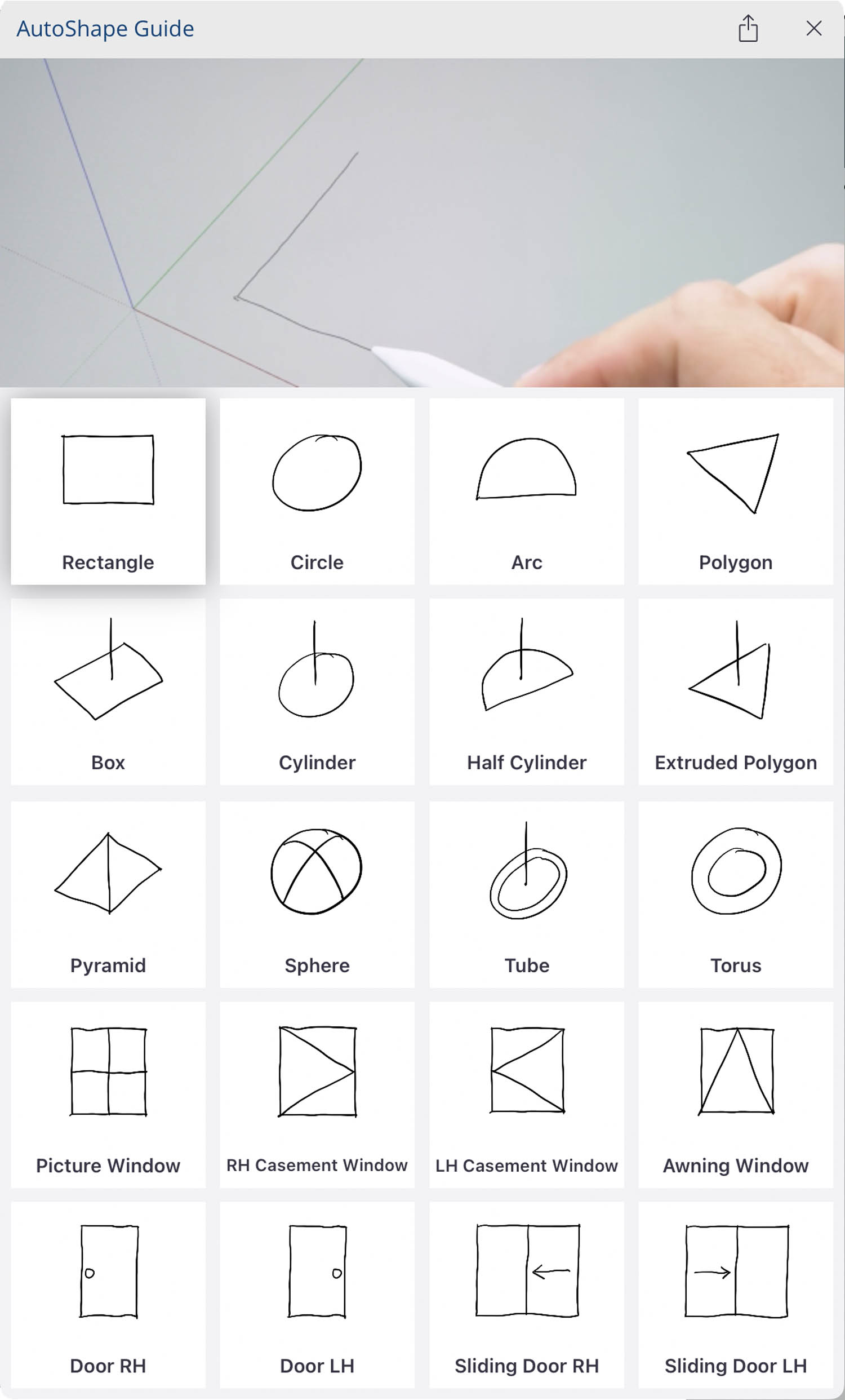
The system supports rectangles, circle, arcs, and polygons, all of which appear as SketchUp geometry about a second later. Rectangles can be drawn within rectangles, automatically snapping when in close proximity, so you can build up a simple floorplan in seconds, then push / pull the geometry to create a 3D shape.
3D primitives, including box, cylinder, extruded polygon, pyramid, sphere, tube, and torus can also be sketched directly. A box is just a square with a vertical line, a cylinder a circle with a line. The length of the line defines the length of the extrusion.
It’s a very quick way to play with simple shapes and explore relationships between forms. If you’re new to 3D CAD, it’s a very nice way to ease you in.
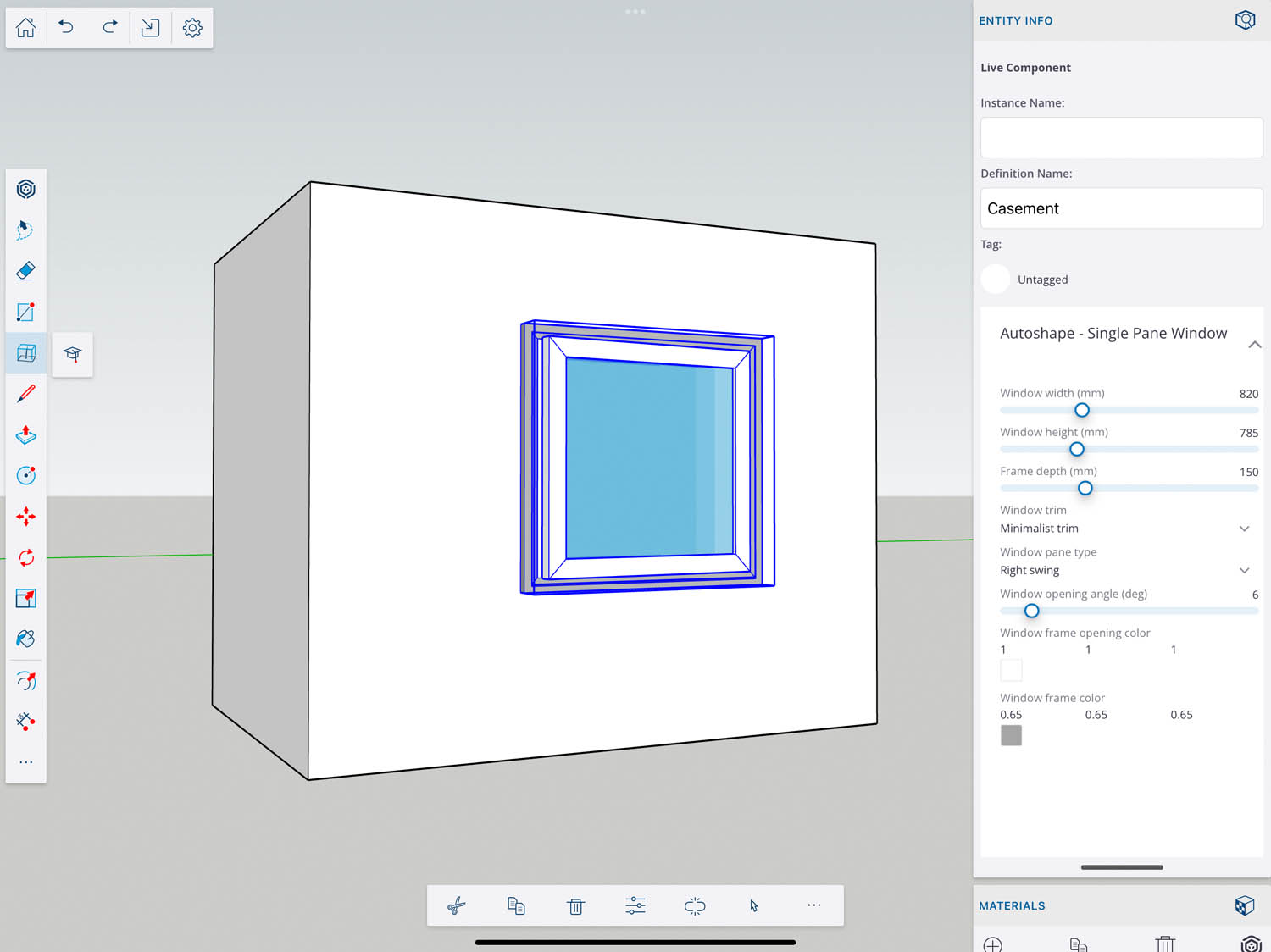
AutoShape also extends to basic parametric architectural objects, including four different types of windows and four different types of doors. Here you sketch out basic architectural symbols that you’d see in an elevation. A left-hand operable door, for example, is a rectangle with a small door knob on the right.
All of the sketches are very intuitive but to get you started there’s an interactive learning guide with sketches and animations that show you how to draw all twenty of the different shapes that AutoShape can recognise.
Wouldn’t it be great if you could teach the system to recognise your own custom doodles, as a kind of a modern day keyboard shortcut?
Going from doodle to parametric object takes a little longer, around five secs. This can be a little frustrating as it can break the creative flow. The reason for this lag is that windows and doors are actually pulled down from SketchUp’s Live Component library in the cloud, so you have to have to an internet connection for this feature to work.
Once placed within SketchUp you are presented with a range of parametrically configurable options. For a multi-unit window, for example, you can mess around with height, width, depth, mullions, and colour. For a door, this extends to handle height and handle type.
AutoShape can be a little hit and miss. It didn’t always recognise our sketches, and occasionally caused the software to crash. We expect this will improve over time.
Of course, you don’t have to use AutoShape to bring in objects. The same parametric Live Components are also available for users to simply download from SketchUp’s 3D Warehouse, which can be accessed via the left-hand toolbar.
Currently, the number of objects that can be generated via AutoShape is quite limited, but we expect this to grow in the future.
We asked Mike Tadros, senior product manager at Trimble SketchUp, if this was on the roadmap. He remained tight lipped, but it was clear it had been discussed internally, “I imagine a world where users could doodle anything from a tree to a faucet to a chair to a park bench, to whatever, and have that be a way that they might go about bringing objects into their SketchUp model,” he said.
It’s still very early days for AutoShape, but our imagination is already running wild. Wouldn’t it be great if you could teach the system to recognise your own custom doodles, as a kind of a modern day keyboard shortcut?
Markup mode
The iPad with touch or Pencil is the perfect device for annotating drawings and models, so it’s no surprise that Trimble has built a markup workflow to capture feedback.
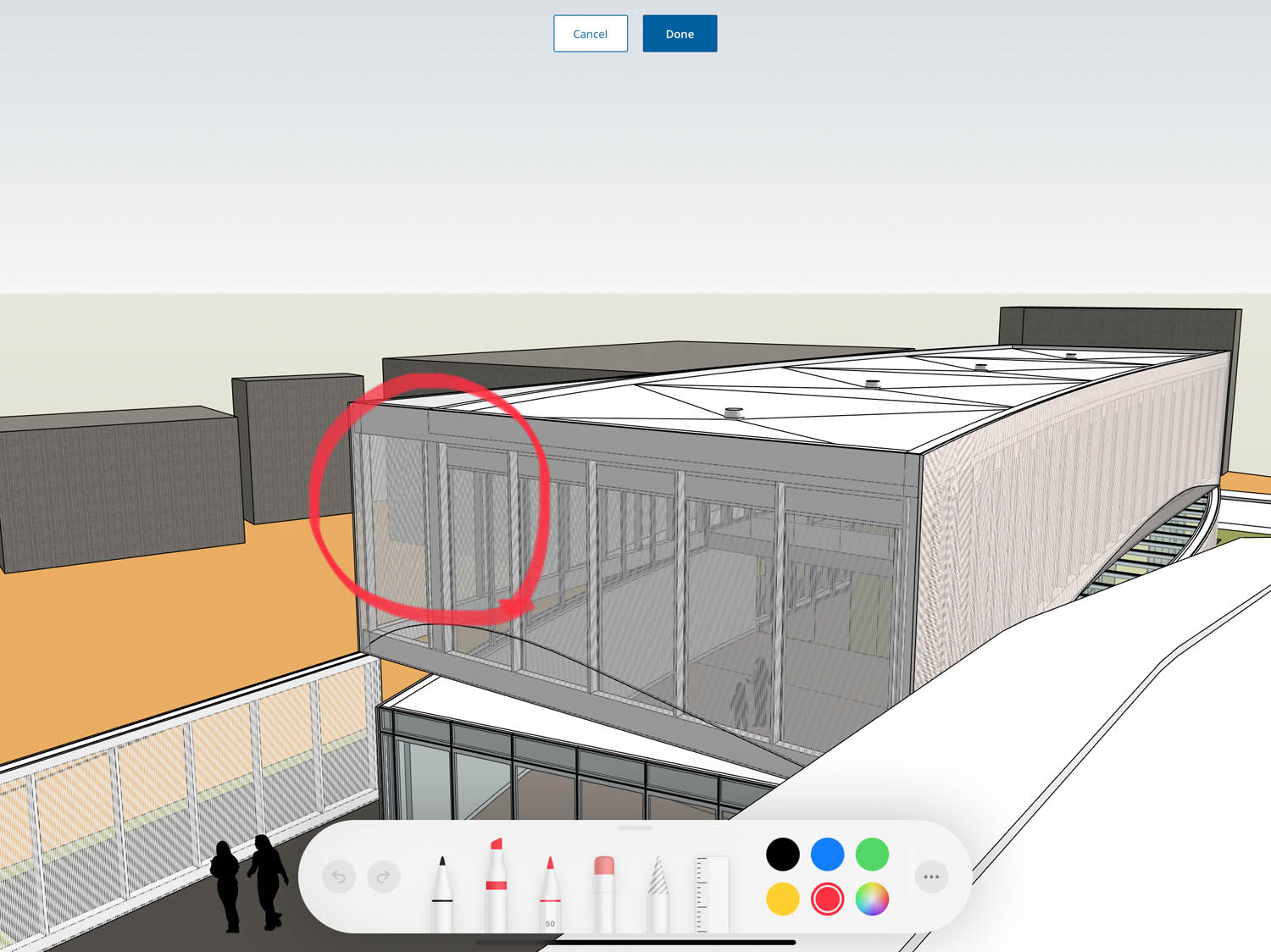
Activating Markup mode causes the rest of the UI to disappear, leaving you with Apple’s pencil kit interface. This gives you the ability to sketch over the top of the 3D SketchUp file and write notes using a variety of pens.
SketchUp automatically saves each markup to a scene in the scenes panel, which is date and time stamped. Markup scenes can be toggled on and off as required and layered on top of each other. The neat thing here is that markups are locked to the view from which they were made, so even though they are two dimensional, they can be clearly seen by anyone who works on the model.
In a collaborative environment, SketchUp files can be shared, and users can choose to draw on top of existing markups or start their own. This could leave you with a very basic audit trail. The software doesn’t automatically record who made which markup, but this can be added manually in the scene name, along with more detailed notes in the description.
While markups can be viewed in the free version of SketchUp for iPad, you’ll need a full licence to add them. Of course, there’s nothing to stop users taking a screen grab and using the markup capabilities of iOS, but then you don’t get the benefit of having the markups resident in the SketchUp file.
The 3D Warehouse
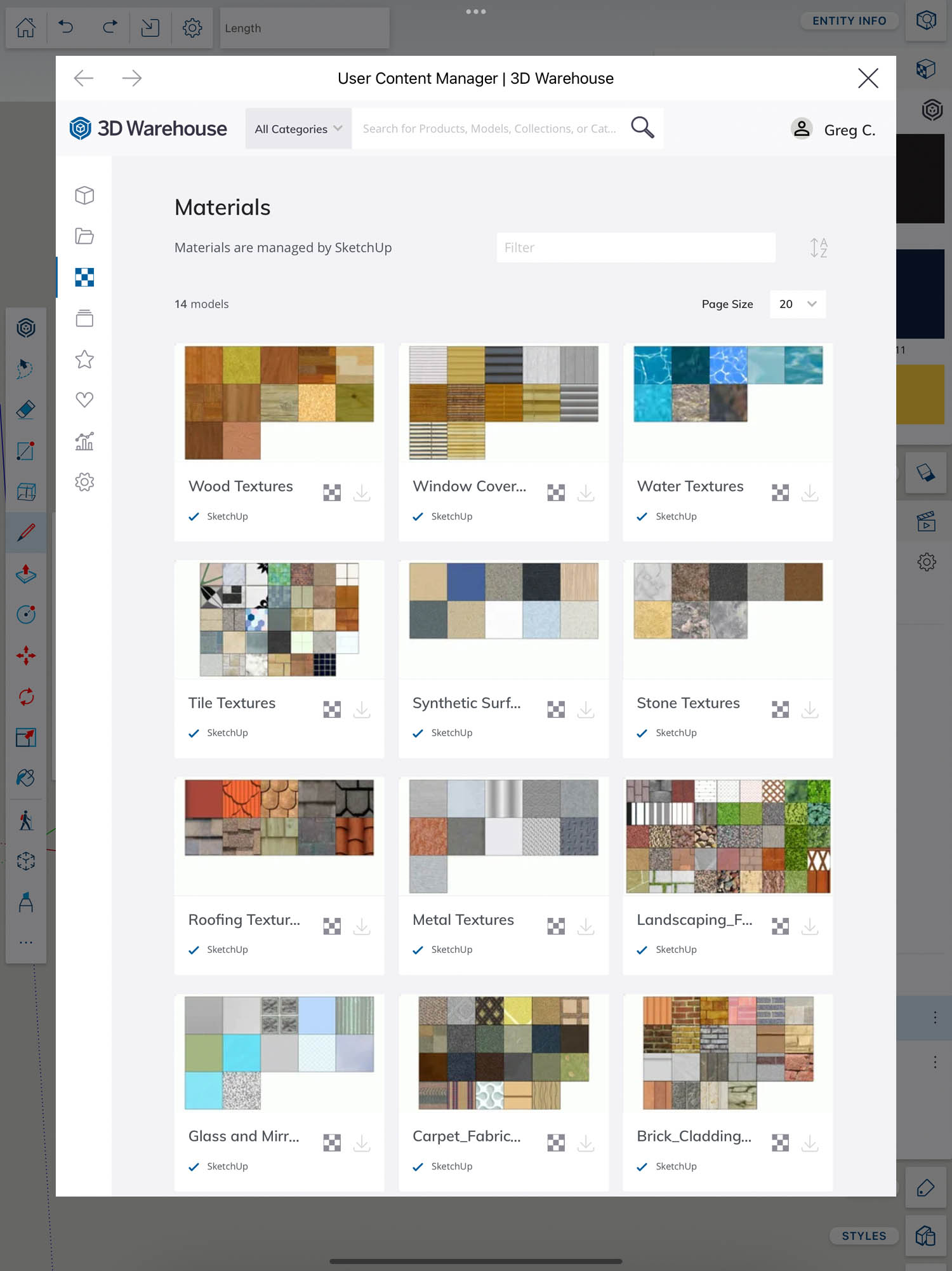
Rather than storing models locally in a component browser, or materials in the materials library, all content is downloaded from the vast online repository that is SketchUp’s 3D Warehouse.
There are over 4 million pre-made SketchUp models of all different types, including over 600,000 real world products that have been published by building product manufacturers. From masonry and lighting to textiles and acoustic panels, there really is something for everyone.
With so many items to choose from, searching for content on the 3D Warehouse can be a bit bewildering. However, official building product content is generally well categorised, and Trimble is actively making is easier for users to manage and curate their preferred content directly in the 3D Warehouse, via the online content manager.
The 3D Warehouse includes a wide range of SketchUp textures, including bricks, metals, glass and tiles. There are even more from third parties, including wallpapers. Once downloaded, each collection remains resident on the device in the materials library. If you can’t find what you’re looking for, you can also create your own materials using the iPad camera.
Connecting physical and digital
There’s an augmented reality (AR) feature which allows you to view your 3D models in the context of the real world. You can either ‘place’ your design on a tabletop for a bird’s eye view, or view it at 1:1 scale, aligned to a physical space.
Accurate alignment between the physical and digital worlds is the holy grail of AR. In SketchUp for iPad it’s a manual process. Trimble’s advice is to first position a camera in the SketchUp model at eye height, at the location where you plan to stand in the real world. Then, when you hit the ‘View in AR’ button, it should be fairly well aligned, although you can still fine tune the model to better fit the space using the move, scale and rotate tools. Alternatively, move the iPad a degree or two in the real world, and then reactivate the scene.
To improve accuracy, and for limiting drift that users typically experience when walking about in a physical space, SketchUp for iPad can use the LiDAR sensor of the iPad Pro.
Of course, the LiDAR sensor can also be used for scanning, to generate a point cloud of a room, to provide context, or to be used as a starting point for new designs.
Unfortunately Trimble has not announced any plans to add a scanning capability into the software, but we think this would be a killer feature for architects working on retrofit projects. And, given Trimble’s heritage in reality capture, it’s not out of realms of possibility that it’s already on the roadmap.
As it stands, you can use a third-party application for this, such as SiteScape, but the workflow is disjointed.
Point cloud data would first need to be converted to a mesh before it could be brought into SketchUp for iPad. Point clouds themselves can only be viewed on SketchUp for desktop using the Trimble Scan Essentials extension, part of SketchUp Studio.
SketchUp for iPad can be used to import satellite imagery and terrain data of existing site locations.
Conclusion
Trimble has done an excellent job of bringing its legendary push pull modelling tool to the iPad. While SketchUp for iPad doesn’t include all the features of the desktop product (in terms of modelling) it certainly doesn’t feel like a cut down version with limited functionality that has tarnished many AEC-centric iPad apps in the past.
The best thing about SketchUp for iPad is the flexibility it gives you. With a £235 per year Pro licence, you get access to SketchUp on any device. Start on iPad, move to Windows or Mac OSX, back to iPad, then on to a browser. It really doesn’t matter. With keyboard and mouse, you can even use SketchUp for iPad in desktop mode, which for some workflows might be preferable.
Then of course, with the Windows desktop app, you can also tap into the vast number of third-party plug-ins, from building performance analysis and 3D printing to visualisation and VR. And with a SketchUp Studio subscription, you can import point clouds or render scenes with V-Ray. This isn’t just a concept design tool to be used in isolation; it can be part of an extended AEC workflow.
The most exciting thing for us is to consider where SketchUp for iPad might go in the future. If Trimble taps into the power of the LiDAR scanner on the iPad Pro, it could transform the way SketchUp is used at those preliminary phases of design. With a quick site survey, and access to a vast library of building components from the 3D Warehouse, it could bring new levels of efficiency to early stage design on retrofit projects.

