Mihail Bila, 3D Artist at Glass Canvas, steps us through the design viz workflow used to create one of the striking stills of Sir John Soane’s Bank Of England entered in the Project Soane competition
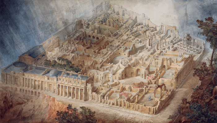
Taking influence from the 18th Century artist Joseph Michael Gandy we have created a set of 3 images of Sir John Soane’s original Bank of England for the Project Soane rendering competition.
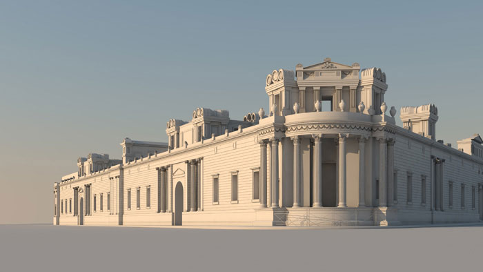
This image features the iconic Tivoli Corner as it might have appeared in the Victorian age. While producing it, I took into consideration three main aspects: composition, atmosphere and painterly feel.
In Gandy’s tradition, I placed the camera at a fair distance, making sure the view captures the building in its entirety. Then I decided to add neighbouring buildings and clearly define the streets and sidewalks in order to evoke the Victorian urban atmosphere. As compositional rules I used the golden rectangle and the golden spiral, applying them for setting the camera angle and later for placing people and carriages in the scene.
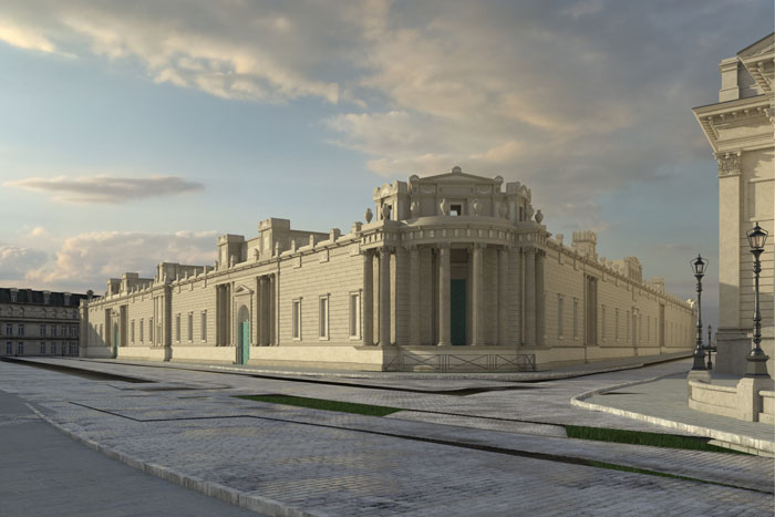
This is the raw render. The only time of the day when any of the two facades captured in the scene would receive direct light was around 7 AM; therefore I chose a low sun HDRI, casting soft shadows that would emphasise the beautiful Neo-Classical architecture. The layout of the clouds, descending from both sides to embrace the Tivoli Corner, enhanced the composition so I decided to keep them unchanged. I made sure the streets and sidewalks were in the right place, although they would later be addressed in post.
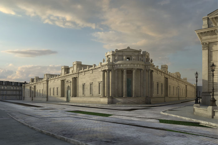
I used the following render elements for compositing in Photoshop: Raw Reflection, Global Illumination, Raw Shadow, ExtraTex, Diffuse and ZDepth. I put the RawReflection layer on ‘Soft Light’ blend mode, applied a completely black mask then chose an oval-shaped soft brush with 25% opacity and started painting white on the mask regions where I thought reflections needed to be enhanced. I’ve done the same with the rest of the render elements until I reached the desired result. I had to invert (Ctrl+I) the Raw Shadow layer though and put on ‘Multiply’ blending mode. Other layers looked better on ‘Screen’, ‘Soft Light’ or ‘Overlay’ modes. After I finished mixing the elements I started painting dirt on the building’s façade; for this I used various smoke brushes on ‘Multiply’ mode, making sure they’re not tiling and their level of transparency is adequate.
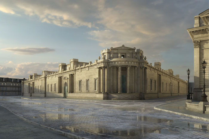
After mixing the render elements, I fixed the street using a clone stamp brush, then I started painting puddles. This can be achieved by using the RawReflection element; however, an even better way to do it is by doing a new render of the street with a highly reflective material. After the render was finished, I included it as a new layer on top of the others, made it invisible by placing a black mask on top of it and started painting puddles here and there with an oval-shaped soft brush. Using masks ensured I kept my layers intact while changing the position of the puddles so that it would contribute to the atmosphere and composition. Puddles tend to dry towards the edges, and reflections become more diffuse. In order to achieve this effect I used the RawReflection element.
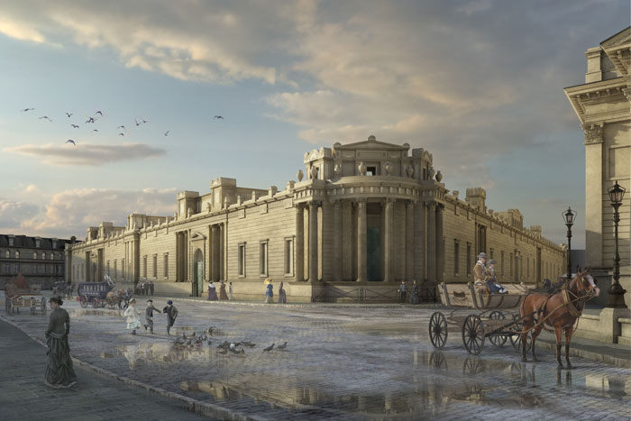
It was time to add some population, as this would have been a very crowded part of the city. Except for the horse and the carriage in the foreground, I used 2D images. When adding people from other photos, it’s important to observe the direction of light and make sure it matches the one you have in your scene. The perspectives and colours also need to match. A good way to do this is by placing the people in the desired locations, adding a Hue/Saturation modifier on top of the layers and completely desaturating the image. You’ll immediately notice which people don’t fit in the scene; they will be either too dark or too washed out. The Levels modifier is great for matching the intensities. After doing that, I turned off the Hue/Saturation layer, matched the colours of the people with Colour Balance modifiers and painted shadows. Now the people looked like they were part of the scene.
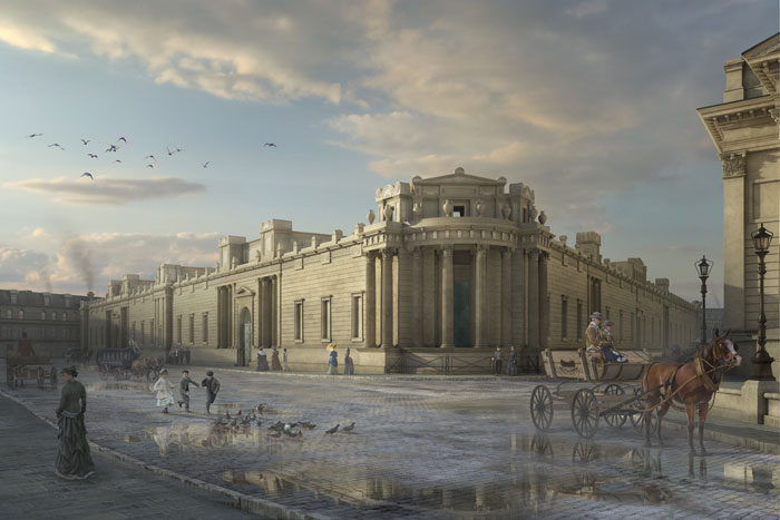
With population added into the scene, the composition was now complete. I focused on the atmosphere and noticed the image lacked depth, so I decided to add the ZDepth render element. There are many ways of doing this, depending on your workflow. The easiest way to do it is by putting the layer on ‘Screen’ blending mode and by applying a linked ‘Curves’ modifier on top, adjusting the intensity of the depth fog. If you work with linked render elements, this method ensures you won’t have to redo the whole process after re-rendering the scene. In this case I chose a more complicated method – I used the ZDepth layer as a mask for a folder in which I included various adjustment layers, which applied directly proportional with the depth level. You can make the colours fade to blue, desaturate colours and decrease the contrast. I painted a general haze, smoke from the chimneys and dust around the wheels of the carriages.
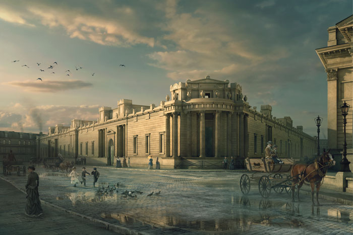
For this particular image I decided to apply a subtle ‘Teal and Orange’ effect, in order to emphasize the unique morning light and maybe evoke the dramatic colours of Gandy’s paintings. Layer adjustments are very useful in achieving this type of effects without affecting the layers underneath, thus allowing for subsequent changes in composition and geometry. In this case, I used various colour lookups such as TealOrangePlusContrast, 3Strip, Bleach Bypass, Candlelight, HorrorBlue, CrispWarm, EdgyAmber, FallColors, LateSunset etc. I usually use them with a very low opacity level (10% – 20%) along with other adjustment layers such as Photo Filters, Color Balance, Brightness/Contrast, Exposure and Levels. Keeping them grouped in folders allows you to turn them on and off and see the difference. After a few minutes of experimenting with various adjustments and making decisions, the image ended up looking like this.
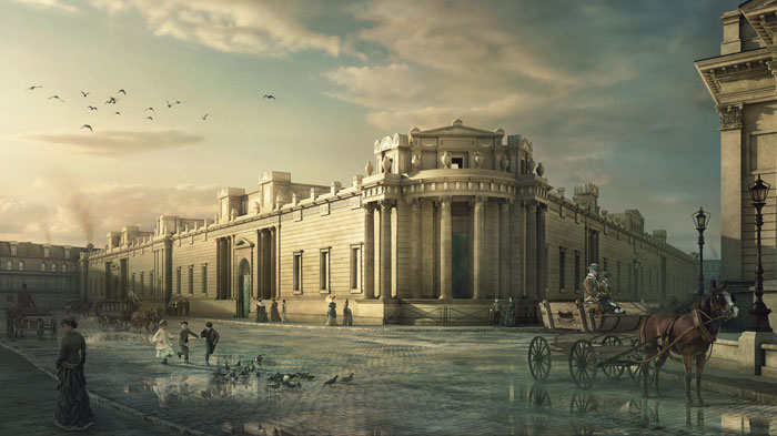
For the final touches I changed the image ratio, emphasized the vignette effect, increased the exposure of the areas in direct sunlight and made them a bit more orange. There are many ways in which you could paint sunlight; you may use an exposure adjustment layer, a Brightness/Contrast layer on ‘Screen’ blending mode or a black layer on ‘Color Dodge’ with very bright yellow/orange painted sunlight. Adding a sharpening filter in the end might also emphasize the graphic character of the image; just make sure this doesn’t add unwanted noise.
To see all some the other winners of the Project Soane rendering competition, sponsored by HP and Nvidia, see here.
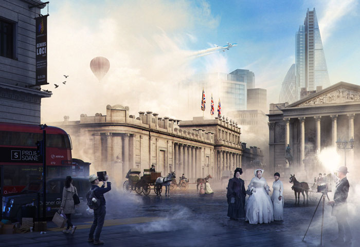
Read AEC Magazine’s report about the Project Soane rendering competition
If you enjoyed this article, subscribe to AEC Magazine for FREE

