Cerulean Labs has developed a unique conceptual sketch and modelling tool specifically for the Apple iPad. While this market segment is crowded with players, Martyn Day thinks this one stands out as a tool for the masses
Conceptual modelling tools seem to be like London buses; you wait an eternity and then a bunch of them show up. The conceptual side of BIM has never had so much development dollars and time thrown at it, as we have seen in the last three years. Who knew there was such a dearth of massing tools? It is true that nobody has completely got conceptual design right, and, despite all this effort, the big daddy of the genre is still Trimble SketchUp.
Tools such as Hypar, Digital Blue Foam, Testfit, the Modelur extension for SketchUp are all impressive, but come with complexity and toolsets that push them to solve niche problems or are more tailored towards developers than designers. What is there for the masses?
What tools are portable, don’t require a cloud connection, are low cost and combine sketching and modelling? We think we have found a good contender in Spaces by Cerulean Labs.
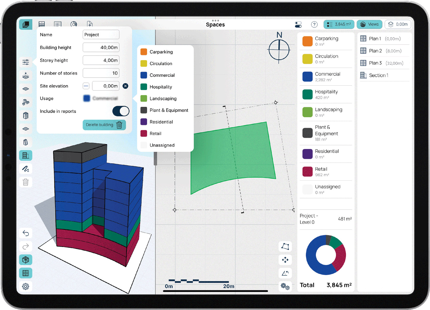
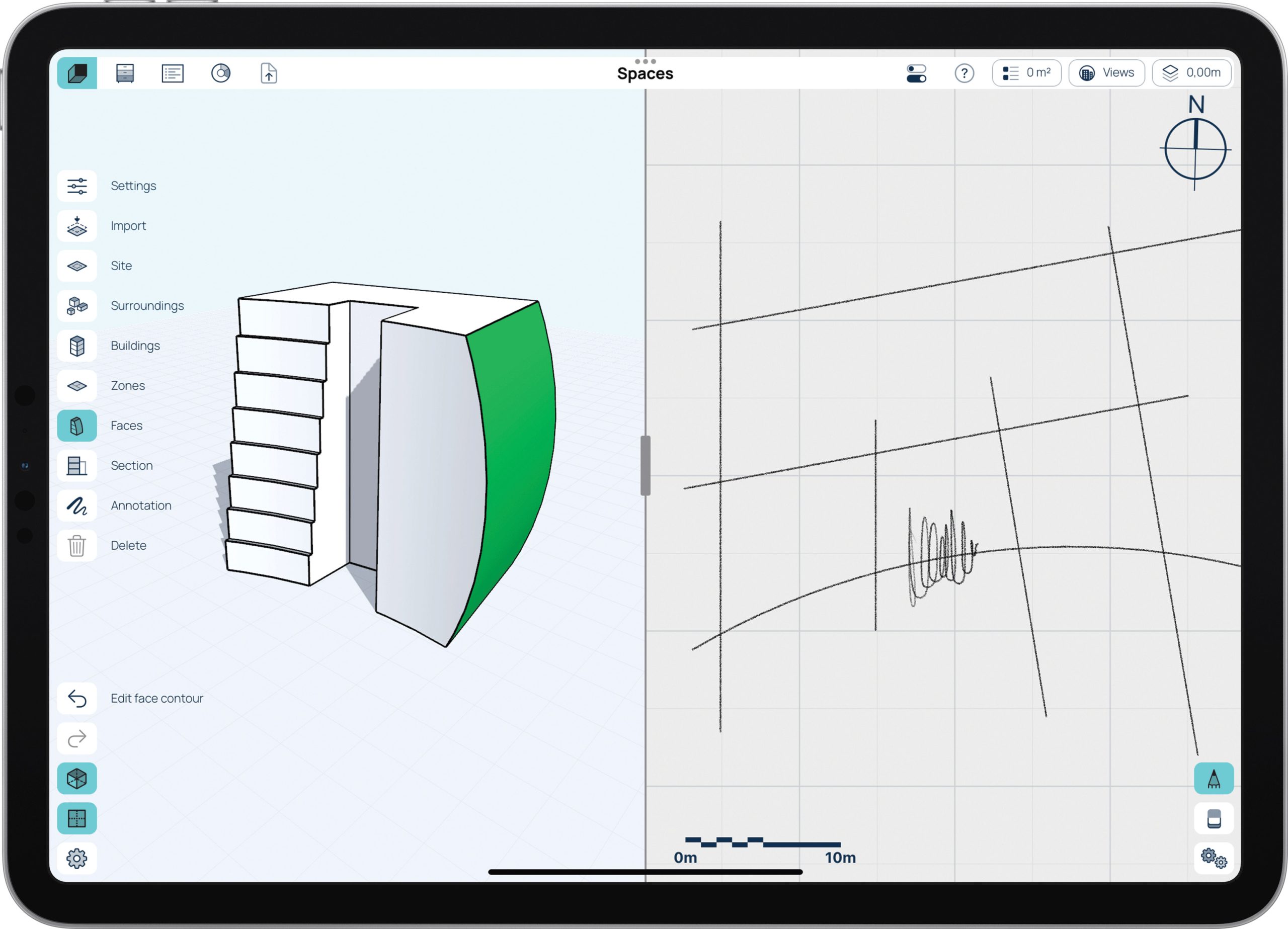
Spaces is an iPad app and it’s been written from the ground up to be a lightweight parametric conceptual design tool that leverages the Apple pencil and the touch screen interface. The screen is split into a 2D sketch plane and a 3D model display and can literally take sketched outlines of arcs and lines and immediately generate multi-storey massing models.
The freehand sketches can be auto dimensioned and altered, driving the changes instantly in the model view. Alternatively, changes can be made directly on the model, down to individual spaces. Floor heights can be altered at any stage, collectively or individually.
The basic idea is for the user to sketch closed volumes and, as each floor is altered, Spaces feeds back the areas, which can be broken down into spaces of usage – e.g. car parking, circulation, commercial, hospitality, landscaping, plant / MEP, residential, retail etc.

The system doesn’t yet use Booleans for modelling but has intuitive editing tools to add curves and rectilinear massing edits, in both plan and profile (changing the slope of a façade), enabling more than the typical blocky basic conceptual tools. The ‘live building model’ means you always instantly see what changes your edits produce both physically and in the live reports of the space allocation breakdown. It’s also possible to generate cut sections to explore the model further.
As with all conceptualising, there are going to be iterative branches and design dead ends. Spaces offers a ‘Design Options’ capability within the same project file, to allow experimentation and alteration. Should it all go wrong, the architect can switch back to the original option. There is also, obviously, an undo capability, but as of yet there’s no tree capability to edit out previously applied edits which you might want to remove retrospectively. This means you have to hit undo to go back to that edit and then redo the work you had done again.
Context
Spaces can bring in site data in underlay maps or models, so it’s possible to model in context, or model and then bring in the site information to do studies such as shadowing. The team has big plans to extend the kinds of analysis that can be added to the program, so the benefit of site analysis is set to grow.
Cladding
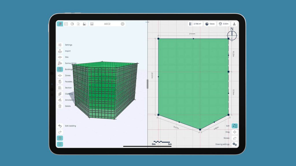
Given that I don’t think I’ve ever seen a conceptual tool cater to display cladding, especially one so young in development, this feature had me scratching my head as to it would get priority over other more conceptual features. However, after some discussion with Campbell Yule, founder of Cerulean Labs, and seeing the results, it does give the impression of a more realistic model, vs the blocky, vector and facet models we are used to seeing.
It also happens to be very easy to define a cladding style and apply it to the model. If you edit the model, the cladding overlay seamlessly regenerates, reacting to the changes – no tedious editing. This can be used for curtain walls, shading systems or combinations of both.
The sketch and instant parametric model paradigm is very clever and means it’s fun to use and there’s not a lot of wrestling with the geometry to make it bend to your will
Spaces has the potential for a user to simply sketch four intersecting arcs and instantly get a five storey 3D model with a predefined cladding style attached. This can be geometrically edited in real time, as well as opting to try out different cladding styles at the click of a button. While these cladding ‘frills’ would undoubtedly be stripped out and replaced in a BIM system like Revit or Archicad, it’s an interesting feature of Spaces.
User interface
With iPad apps the skill is not to clutter the interface and here Cerulean Labs has done a good job of providing useful information around the display edges, such as scale/meniscus, annotation, zones, site, import etc. The Sketch and the Model spaces are separated via a slider. This means you can maximise the area for sketching, or modelling or opt for a medium setting to see both the underlying sketches and the resultant model.

To me, the whole tablet world tends to get fixated on being a portable device on which to consume data, as the apps available are always cut down or feature limited. While it’s early days for Spaces, it’s clear to see that the trajectory of development is to create a professional application that really couldn’t exist in any other computing medium, due to the portability and pen input. It’s very much intended to be the digital notebook for architects and because it doesn’t rely on the cloud, you can literally model anywhere.
Output
The underlying model is essentially an IFC definition. Soon this will be able to be exported and used as a basis for detailed design in your favourite BIM tool (this feature is limited to the subscription level).
Spaces has a capability to share projects with other Spaces users, who can use the free (or paid) version to open and view the models. If anyone makes any edits, it only applies to the version on their tablet, as opposed to your original.
Pricing
There is a feature limited free version of Spaces which allows three projects. A standard version at $39 a month has unlimited projects and features shadow studies and cloud backup. Q2 2022 will see the introduction of Spaces Pro at $99 which adds IFC export, space planning and room briefing. Spaces is available on the App Store or, for multiple copies, via the Spaces website.
Conclusion
Spaces might look like a pretty simple tool, but it’s actually got a lot of hidden depth and capability, even though it only launched October 2021. The sketch and instant parametric model paradigm is very clever and means it’s fun to use and there’s not a lot of wrestling with the geometry to make it bend to your will. This isn’t Rhino Grasshopper or Hypar for architects who can script; it’s a tool for every architect.
It’s going to be interesting to see how the product develops and how adoption grows. It’s very much a product for the masses, an area where SketchUp has dominated. It’s clear to us that the iPad presents a perfect environment for sketch-based design and modelling and we are sure this will soon become a contested area. In the AEC world, tablets are finally contending against laptops for professional applications, as opposed to being mere second tier data consumption devices.


